
Squarespace has been one of the top website builders online for close to two decades, and it earned that reputation honestly. It’s one of the most user-friendly, intuitive builders out there. It comes with a genuinely large library of creative tools, and you need zero prior experience to build something that looks professional.
In this tutorial, I'm walking through the entire process step by step: signing up, picking a template, building your logo, customizing every section, adding a contact form, connecting a domain, and publishing. No code, no guesswork.
Prefer to watch it happen on screen? Below is the video walkthrough. Or skip past it and follow the written steps below.
Squarespace works best for portfolios, service businesses, and simple brochure sites where design matters more than deep customization. If you eventually want more control over plugins, functionality, or scaling, WordPress gives you more room to grow long-term. Squarespace just gets you there faster on day one.
The overview video covers the full flow. The screenshot below shows the exact screen you land on when you sign up.
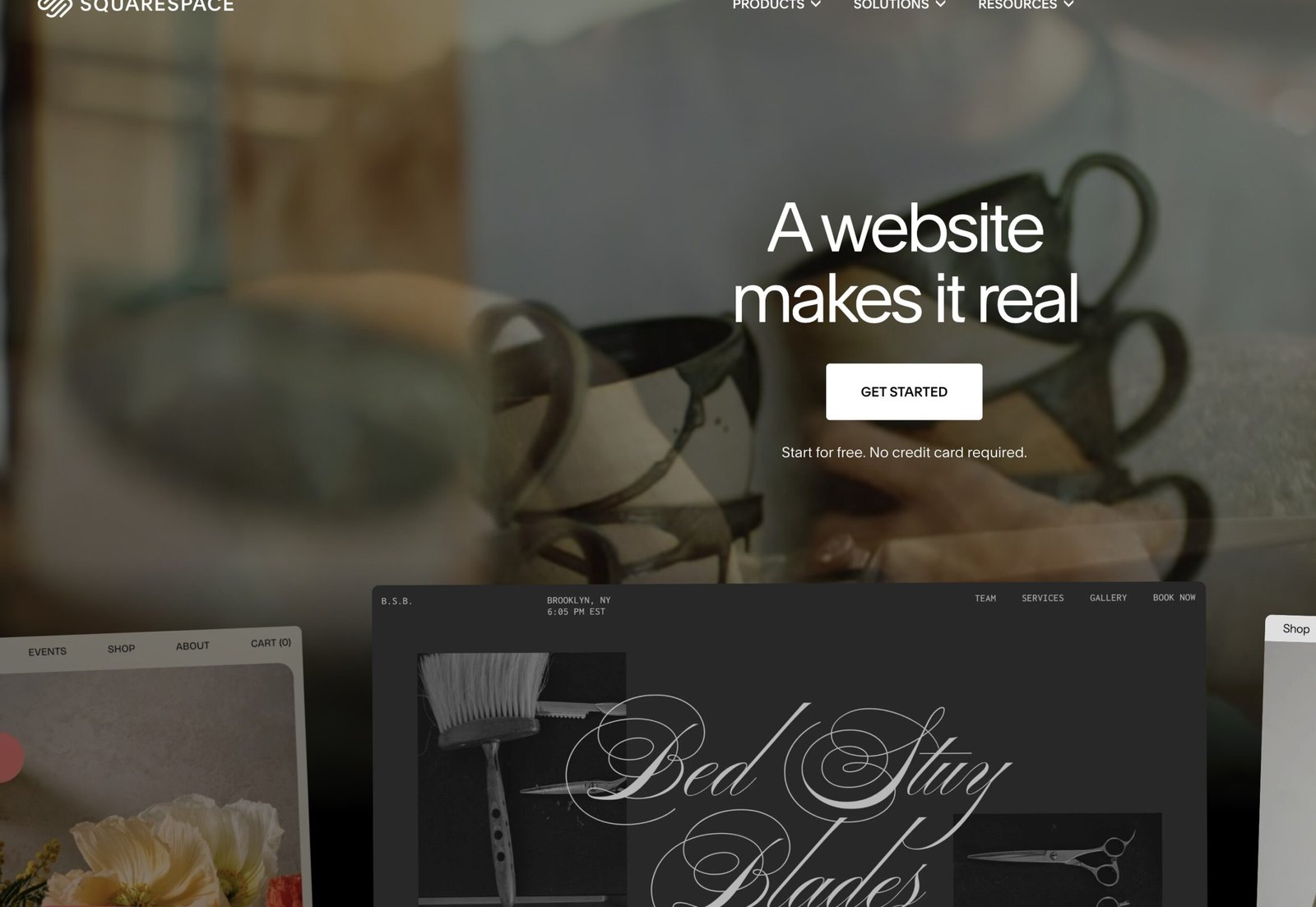
The homepage is the entry point. Hit Get Started (or use the affiliate link above) and you land in the onboarding flow. Skip the questionnaire with I'm just browsing if you want the template library immediately.
Step 1: Sign Up for a Squarespace Account
Head to Squarespace to get started. You’ll land on a page asking a bunch of setup questions. Skip all of it by clicking I’m just browsing in the top right, which drops you straight into the template picker.
Step 2: Pick a Starting Template
Scroll through the categories on the left and look for anything close to your site's niche. If nothing matches exactly, that's fine. Go with one of the popular designs, that's honestly the best way to go when you're not sure. Click Preview on a few templates and look at the overall layout, not the stock photos or placeholder text. Every image, color, and word gets swapped out later. You're only judging the structure: where the header sits, how sections stack, whether it feels right for what you're building.
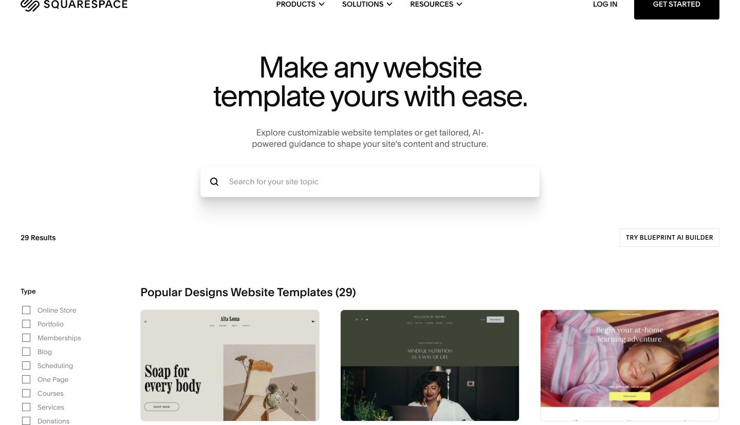
Outside of commerce, the full template gallery filters by Popular Designs if you'd rather browse everything before narrowing in on a category.
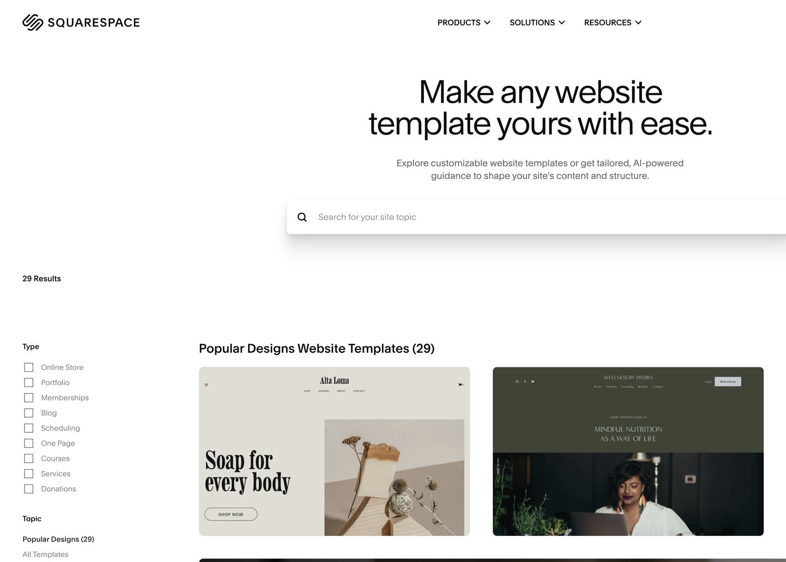
Click into any template to preview it live before you commit to it.
Preview a few templates before you commit. You can switch later, but starting close to your layout saves a lot of rebuild time.
If you have no idea which to pick, go with one of the popular designs. They’re popular for a reason, and you can restyle any of them heavily once you’re inside the editor.
Step 3: Build a Logo
You don’t need a designer for this. A free logo maker (or a tool like Canva) gets you a clean, simple mark in a few minutes. Search for an icon that fits your niche, pair it with your site name in a clean font, keep the color palette to one or two colors, and export it. The simpler the logo, the better it tends to look at small sizes in a header.
Once you’ve got the file, upload it under your site title in the Squarespace editor and it replaces the placeholder logo immediately.
Step 4: Choose Your Fonts and Colors
Squarespace walks you through font and color palette selection right after your logo. Pick a palette that matches your brand, or build a custom one. You can always come back later under Design → Fonts and Design → Colors to adjust individual elements, like button color or heading style, without touching anything else on the site.
Step 5: Edit Your Pages
Every template comes preloaded with pages you probably don’t need. Go to Pages and delete anything irrelevant, then add the ones you actually want: About, Services, Portfolio, Contact, whatever fits your site. Adding or removing a page automatically updates your site’s navigation menu, so there’s no separate menu to manage.
In the Squarespace editor, use the page list on the left to jump between sections instead of scrolling the live preview. That keeps you from accidentally editing the wrong block when two sections look similar on mobile.
Drag pages up or down in the list to reorder your navigation, and check each new page’s URL slug under its settings so it matches what you want your final domain path to look like.
Step 6: Customize Every Section
This is where most of your time goes. Hover over any section and you’ll see edit controls appear. A few things worth knowing:
When you change a section background, preview it on phone width before moving on. Squarespace crops background photos differently on small screens, and fixing that early saves a round of rework at the end.
- Backgrounds: every section can use an image, a video, or a solid color. Squarespace includes a library of free stock images built in, and you can pull in more from a site like Pexels or Unsplash.
- Text: double-click any text block to edit it directly on the page. Heading levels control both the size and the ability to restyle every instance of that heading sitewide at once.
- Buttons: change the label, the destination link, and the size independently. A clear call to action beats a generic “Learn More” almost every time.
- Galleries: drag and drop images directly into a gallery block, then reorder them by dragging thumbnails around.
Repeat this section by section. It’s repetitive by design. Once you’ve customized two or three sections, the rest move quickly because you already know where every setting lives.
One habit that saves time: finish the homepage first, then clone its section styles onto About and Services instead of redesigning every page from scratch. Squarespace's site styles (fonts and colors) already cascade, so lean on that instead of hand-tuning every heading.
Step 7: Add a Contact Form
A contact form is non-negotiable if you want visitors to actually reach you. Add a contact section, then open the form settings to add or remove fields (name, email, phone, message) and mark which ones are required.
The part people skip: connect the form’s Storage setting to the email address you actually check. Without it, submissions go nowhere and you’ll never know a lead reached out.
Test your contact form before you launch. Submit it yourself once you’ve connected your email, and confirm the message actually lands in your inbox. A broken contact form is one of the most common (and most costly) mistakes on a new site.
Step 8: Add a Favicon
Your favicon is the small icon that shows up in a browser tab next to your page title. Use the same simple icon from your logo (or a simplified version of it), then upload it under Design → Browser Icon (Favicon). It’s a five-minute step that makes a site feel finished instead of default.
Step 9: Fill In Every Page
Go back through Pages and open each one you created earlier. Add content blocks (text, images, video, galleries) the same way you customized your homepage sections. Any page that’s still blank when you launch reads as unfinished to a visitor, so don’t skip this even on pages that feel secondary.
Step 10: Connect a Domain and Choose a Plan
Squarespace currently sells three main website plans on annual billing: Basic ($19/month), Core ($29/month, marked Recommended), and Plus ($49/month). Annual plans still include a free custom domain for the first year. Prices change, so always confirm on the pricing page before you buy.
After the walkthrough, use the screenshot as a quick reference for where that option lives in the interface.
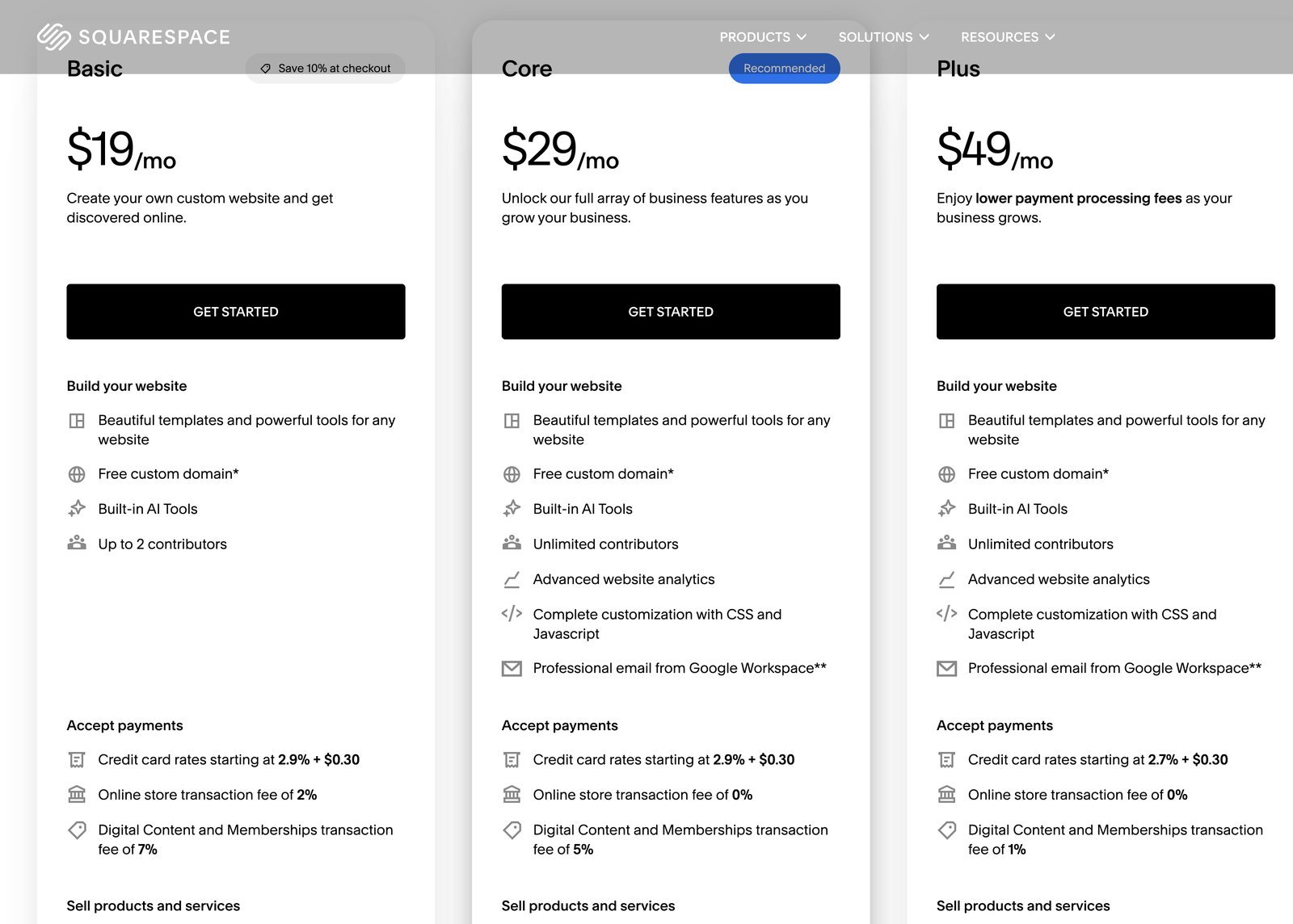
The screenshot shows one option in context. Use the table to compare it against the alternatives before you commit.
| Plan | Price (Annual) | Best For |
|---|---|---|
| Basic | $19/mo | Portfolios, blogs, simple brochure sites |
| Core | $29/mo | Small businesses and service providers (Recommended) |
| Plus | $49/mo | Stores that want lower processing fees |
If you’re not selling anything yet, Basic is enough to launch. The moment you’re taking payments or bookings through the site, Core removes the transaction fee Basic charges and is worth the extra few dollars a month.
Step 11: Publish Your Site
Your site sits in Private mode by default while you build, which keeps it hidden from search engines and visitors. Once everything’s ready, go to Settings → Site Availability, switch it to Public, and save. That’s it. Your site is live.
Squarespace vs. WordPress: Which Should You Use?
I use WordPress on nearly everything I build, and it’s not because it’s easier. It’s because it gives you more control long-term: any plugin, any functionality, any theme, and no ceiling on how far you can scale. Squarespace trades some of that control for speed. You’ll have a polished site live in an afternoon with almost no learning curve.
Use that demo as context for the side-by-side below.
| Fastest launch Squarespace | WordPress | |
|---|---|---|
| Overall rating | ||
| Time to polished site | Afternoon | Longer setup |
| Hosting included | Yes | Separate host |
| Plugin / app ceiling | Limited | Unlimited |
| Best for | Portfolios & service sites | Growth, stores, full control |
Swipe to compare more options. Squarespace stays pinned.
Pick Squarespace when design speed wins. Pick WordPress when you know you will need plugins, custom checkout, or long-term ownership.
If you want the trade-offs spelled out in plain English, here's the short version:
Squarespace vs. WordPress
When Squarespace makes sense, and when WordPress is the better long-term call
Squarespace
- Fastest path to a polished site Design, hosting, and domain are bundled into one plan with almost no setup.
- Built-in templates that look professional out of the box Every template is designed in-house, so there’s no theme-quality guesswork.
- Everything in one place Hosting, security, and updates are handled for you. Nothing to maintain separately.
WordPress
- No ceiling on functionality Tens of thousands of plugins mean there’s almost nothing WordPress can’t eventually do.
- You own everything Your content, your data, your checkout. You’re never locked into one company’s platform.
- Built to scale with you From a simple blog to a full store to a multi-author publication, WordPress grows with the site instead of capping it.
Still deciding between the two? Our Wix vs. WordPress breakdown covers a lot of the same trade-offs, or run every option side by side in our website builder comparison.
Check out our related guides including our best free website builders roundup (if you are still testing), the Hostinger review for WordPress hosting once you outgrow a hosted builder, and the Elementor tutorial if you switch to WordPress later.
Commerce Templates and Store Setup Notes
Squarespace store templates front-load product grids, cart icons, and checkout styling. Pick commerce-first designs if you know you are selling physical goods. Switching later means rebuilding section order and re-testing mobile product pages.
Inventory, variants, and shipping profiles live outside the pretty template. Block time to add real SKUs, weights, and tax regions before you announce launch. Placeholder products make checkout testing lie to you.
Digital products and services work, but read plan limits on transaction fees and abandoned cart features. Sometimes the Basic tier is fine for a brochure site; stores usually want Commerce tiers for analytics and discounts.
If you might outgrow templates, skim Wix vs WordPress and website builders compared before you load five hundred SKUs into a closed platform.
Connect the payment processor and test a one-dollar live charge, then refund it. Template demos never catch misconfigured Stripe keys.
Shipping zones and carrier accounts confuse beginners more than template fonts. Squarespace walks you through domestic flat rate first. Expand to international when orders prove demand.
Product photography beats theme skin every time. Budget a shoot or consistent mockups. Commerce templates can't save blurry phone photos on white backgrounds.
When Squarespace Gets Slow to Customize
Squarespace is fast until you fight the section model. Nested folders in navigation, duplicate section backgrounds, and mega-menus that were never meant to exist are what actually slow you down. Flatten your pages, About, Work, Contact, each as a real page, not a folder pretending to be a dropdown unless you genuinely need one, and delete demo pages like Projects, Partners, or News before publish if they're empty shells. A cleaner sitemap beats one full of placeholder slugs that confuse Google and humans alike.
Color palette edits ripple globally: change the footer green to charcoal, and every section using that swatch updates with it. That's good for consistency, but frustrating when you only wanted one band different. Use custom one-off colors sparingly instead of fighting the global palette. Section duplication is the fastest way to build similar layouts: duplicate a working band, swap the text and image, and adjust spacing once. Work section by section instead of jumping around, so QA stays possible before you connect the domain.
Mobile previews are mandatory, not optional. Background photos crop differently on phones, and text that clears your desktop header can collide with it on smaller widths, so customize section padding per breakpoint whenever the editor exposes that option.
Give your logo, favicon, and social preview image a final pass before launch. Squarespace bundles logo tools, but export SVG or PNG masters anyway for email signatures and your Google Business Profile. When publish day arrives, run through pages in order: home, store, policy pages, a contact form test, then connect the domain last. Squarespace hides DNS settings until the final steps, so don't skip the domain checklist just because the temporary URL looks fine.
If you're still weighing Squarespace against a self-hosted option, our free website builders roundup and beginner WordPress guide cover the ownership and plugin tradeoffs, and Wix vs WordPress has migration notes if WordPress flexibility calls later. When a client asks about WordPress mid-project, send them the beginner WordPress guide above instead of debating platforms over email for three weeks.
Built-in analytics show top pages and traffic sources, export notes monthly rather than bolting on ten extra tracking scripts a Squarespace shop doesn't need until revenue justifies the setup tax. If you're planning member areas or gated content, map which pages stay public before you sell any memberships, retrofitting a paywall rearranges navigation more than most beginners expect.
A handful of smaller settings are worth locking in before you scale up content:
- Stage your launch — draft every page first, connect the domain, then flip the site live once your email and social assets line up. Publishing in stages instead of all at once catches typos before a newsletter sends.
- Run the accessibility checker — contrast warnings on buttons and text over photos usually correlate with real readability problems on phones in bright sunlight, not just compliance boxes to check.
- Fluid Engine vs. classic templates — if a tutorial was filmed on classic templates and doesn't match your editor buttons, that's the newer Fluid Engine snapping blocks to a different grid. Check Squarespace's docs for your specific template type.
- Pick one primary domain — www or apex, then redirect the other so analytics and SEO authority don't split across duplicates.
- Blog posts vs. pages — use blog posts for anything time-stamped like announcements. Evergreen service pages don't need a date confusing the search snippet.
- Test print preview before you promise a client a polished one-sheet from browser print alone, and limit third-party embeds like Instagram, Spotify, or Eventbrite per page when mobile scores matter for an ad campaign or launch week PR.
Cleaning Up Template Navigation
Creating navigation from scratch is straightforward once you know where things live. Add blank pages from the plus button, name them About or Photos, and set the URL slug in the settings wheel. Reorder everything in the pages panel, and confirm each slug before you add it to the menu: “about” versus “about-us” mismatches break links the moment you paste a URL into an email campaign. Empty pages are fine during setup; duplicate a home section later to fill them in quickly. Clicking your logo returns you home while editing. Header logos stay hidden on dark hero images until you upload a light version, so fix that before publish, or mobile visitors won't see your mark.
Reorder menu items by dragging them in the pages panel, changes go live the moment you save, so test every link after a reorder sprint. Template selection sets your starting layout, browse categories before you commit since switching later costs real time. Here's what that selection screen looks like:
Section styling controls backgrounds and spacing. This clip shows the panel where most design tweaks happen:
Always preview mobile before publish. Squarespace hides breakpoint controls in this toggle.
Once you've seen how the templates and mobile preview work, here are the questions people ask most.
Frequently Asked Questions
Is Squarespace free?
No. Squarespace offers a 14-day free trial, but publishing a live site requires a paid plan. Current plans run from $16/month (Basic, billed annually) up to $99/month (Advanced) depending on the features and transaction fees you need.
Which Squarespace plan should I choose?
Basic works for portfolios, blogs, and simple brochure sites with no sales. Core is the most popular choice for small businesses and service providers because it removes Basic’s transaction fee. Plus and Advanced are built for stores doing meaningful sales volume.
Do I need to know how to code to use Squarespace?
No. Every step in this tutorial, from templates to backgrounds to forms, is fully visual. You never touch HTML or CSS to launch a complete site.
Can I use my own domain with Squarespace?
Yes. Every annual plan includes a free custom domain for the first year. You can also connect a domain you already own from another registrar under Settings → Domains.
Squarespace vs. WordPress: which is better?
Squarespace gets a polished site live faster with almost no learning curve. WordPress gives you more long-term control: unlimited plugins, full ownership of your data, and no ceiling on how far the site can scale. For a simple portfolio or service site, Squarespace is often enough. For anything you plan to grow aggressively, WordPress is the stronger long-term foundation.
How long does it take to build a Squarespace site?
A simple site following the steps in this tutorial, sign-up, template, customization, contact form, domain, can realistically be built and published in an afternoon. More complex sites with many pages take longer, but the platform itself isn’t the bottleneck.
Can I sell products on Squarespace?
Yes. Every plan supports selling, but the fees differ. Basic charges a 2% transaction fee on physical goods and 7% on digital products. Core removes the physical-goods fee entirely and drops digital fees to 5%. Plus and Advanced reduce digital fees further for stores doing real volume.
That’s the full process: sign up, pick a template, customize every section, connect a domain, and publish. Squarespace genuinely is one of the fastest ways to get a professional-looking site live without touching code. If you outgrow it later, or you want more control from day one, that’s exactly what WordPress is built for.