
A website can have a beautiful palette and still feel completely wrong. The usual problem isn't the shade of blue. It's that every hue is trying to do the same job.
My default is simple: pick three brand colors, give each one a role, and reuse them everywhere. Add a light surface and dark text for readability. That's enough for most business sites, portfolios, blogs, and stores.
This guide shows you how to build that system, check the contrast, and apply it without turning every page into a different mood board.
The quick answer: start with color roles
Don't begin with five attractive swatches. Begin with the jobs your interface needs those swatches to perform.
| Color role | What it controls | A practical starting point |
|---|---|---|
| Primary | Main buttons, links, active states, and key brand moments | One recognizable brand color |
| Supporting | Highlights, secondary sections, icons, or charts | A quieter color that does not compete with the primary |
| Surface | Page backgrounds, cards, forms, and alternating sections | White, off-white, pale gray, or a very dark neutral |
| Text | Headings, body copy, captions, and labels | Near-black on light surfaces or off-white on dark surfaces |
| Semantic | Success, warning, error, and informational messages | Clear colors paired with icons or text labels |
Most visitors should notice the message first and the palette second. When the roles are clear, the site feels cohesive even if the actual hues are quiet.
Start with three brand colors. Give one the button job, one the supporting job, and one the surface job. Black, white, and gray can handle text and utility work without making the palette feel larger.
What makes a website color scheme work
A palette is the set of swatches you choose. A color scheme is the way those swatches work together on a real website. That difference matters because a neat row of hex codes doesn't show which shade owns the button, whether body text is readable, or what happens when two tinted sections touch.
A useful scheme creates hierarchy. The accent tells the eye where to click. The surfaces separate sections. The text stays readable for more than a headline. Repetition makes separate pages feel like the same brand.
Dale shows that idea near the end of the video below. Even on a colorful site, the repeated relationships make the design feel intentional.
The full walkthrough covers gradients, motion, spacing, depth, and palette cohesiveness. The final lesson begins with the same three-hue approach used throughout this guide.
Choose the right type of color scheme
You don't need a design degree or a perfect color wheel. You need an approach that limits the number of decisions. These four cover almost every beginner website.
| Best starting point Neutral + accent | Monochromatic | Analogous | Complementary | |
|---|---|---|---|---|
| How it works | Mostly neutral surfaces with one strong brand color | Light and dark versions of one hue | Neighboring hues from the color wheel | Opposite hues used with restraint |
| Best for | Business sites, portfolios, and stores | Calm, consistent brands | Warm or expressive brands | Bold campaigns and calls to action |
| Beginner difficulty | Easiest | Easy | Moderate | Harder |
| Main risk | Using the accent everywhere | Not enough contrast between roles | The hues can blur together | Both hues competing for attention |
Swipe to compare more options. Neutral + accent stays pinned.
For a first website, neutral surfaces plus one strong accent make hierarchy and contrast much easier to control.
Neutral plus accent is my first choice for most projects because it makes the important action obvious. Monochromatic is also forgiving. Complementary palettes can look great, but one color needs to lead while the other stays in a supporting role.
Monochromatic
Choose one hue, then use lighter and darker versions of it. This creates an immediate sense of order. The risk is weak contrast, especially when two medium shades sit next to each other, so keep a true light surface and a clearly dark text value in the system.
Analogous
Choose neighboring hues, such as blue with teal or orange with warm red. The relationship feels natural, but the shades can blend together. Assign one to actions and keep the other for larger decorative areas.
Complementary
Opposite hues create energy and strong separation. They also compete quickly. Use one as the brand anchor and reserve the opposite for small accents, badges, or a single campaign moment.
Neutral plus accent
Use white, cream, gray, charcoal, or navy for most surfaces and text. Add one saturated accent for links, buttons, and active states. This approach puts the content first and gives every important action a consistent visual signal.
Build your website color palette step by step
The fastest workflow starts with what already exists, then tests the palette on a real page. Don't wait until the full site is finished to discover that the logo blue disappears on white.
1. Collect the visual anchors
Start with the pieces you can't easily change: your logo, product packaging, photography, storefront, or existing brand material. Pull two or three shades from those assets. If you're starting with nothing, collect a few websites that fit the mood of your offer and write down what you like about them.
The audience and offer matter more than a generic color-psychology chart. A bright yellow can feel playful on a kids' product and urgent on a warning banner. Context gives the hue its meaning.
2. Choose one primary action color
Your main hue needs a clear job. Use it for primary buttons, important links, selected navigation, and other moments that ask the visitor to act. Test it against the surface where it will appear, not on an empty white artboard.
If your site has three button shades, visitors have to relearn the interface on every section. One repeated action style turns the palette into a navigation tool.
3. Add a supporting color
The supporting hue creates variety without stealing the button's job. Use it for icons, small highlights, secondary backgrounds, chart elements, or an occasional section. Choose something quieter than the primary, or use a lighter tint from the same family.
4. Build the neutral system
Neutrals do most of the work. Choose a main page background, an alternate surface for cards or sections, a heading value, and a body-text value. That gives the layout depth before you add another saturated hue.
For a light site, near-black text often feels softer than pure black while staying readable. For a dark site, use a slightly muted off-white for long paragraphs and save pure white for the strongest headings.
5. Generate and save the exact values
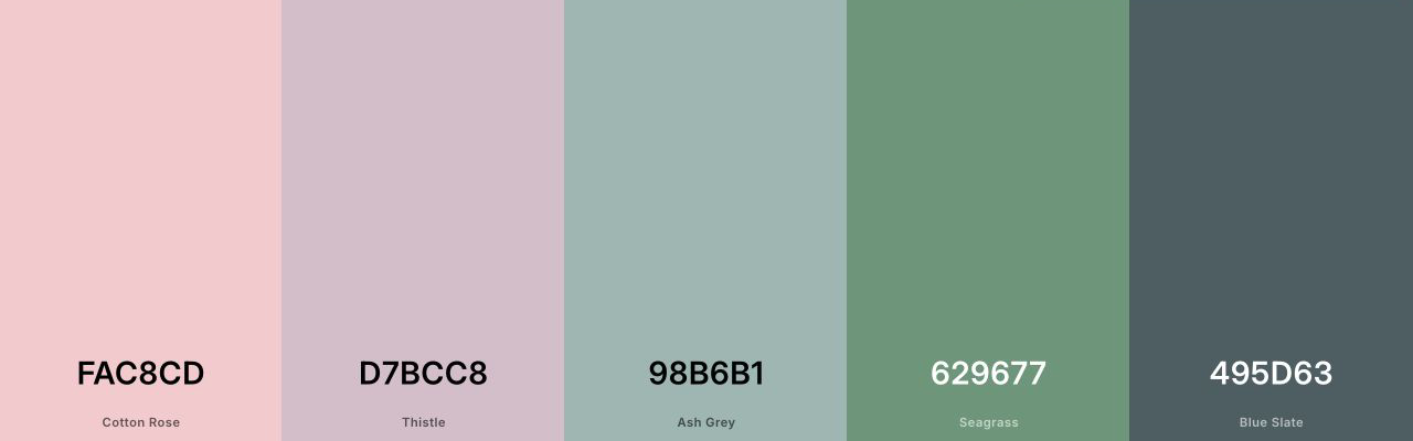
A tool such as Coolors can speed up the exploration. Lock the shade you already know, generate alternatives around it, then copy the final hex codes into your brand notes. Dale uses this same lock-and-generate workflow when building sites.
6. Apply the colors globally
Add the final values to your builder's global styles, theme settings, or design system. Name them by role, such as Primary Action, Supporting, Surface Light, Surface Dark, and Body Text. Names like Blue 1 and Blue 2 tell you nothing six months later.
If you're still choosing a platform, our website builder guide compares the current options. WordPress users can follow the Elementor tutorial for visual editing and responsive controls.
7. Test real pages on desktop and mobile
Put the palette on the homepage, one text-heavy page, a form, and the smallest phone layout you support. Check navigation, headings, links, buttons, cards, form labels, error messages, hover states, and keyboard focus. The system is finished when it survives the boring parts of the website.
Check contrast before you fall in love with the colors
WCAG 2.2 calls for a contrast ratio of at least 4.5:1 for normal text and 3:1 for large text. Important interface components and visual states need enough contrast to be identified as well. Those are thresholds, not targets to round up to.
Color also can't carry meaning by itself. The W3C use-of-color guidance recommends a second cue, such as an icon, underline, label, or pattern. A red outline around a form field isn't enough if the visitor can't see the difference.
Test the exact pair. A brand blue may pass on white and fail on a pale blue card. Check every foreground and background combination used for text, controls, focus states, and important graphics.
Do the contrast check before you build twenty pages. Adjusting one global value takes seconds. Repairing a site full of one-off overrides takes hours.
Use color to guide attention
The loudest hue should usually occupy the least space. A mostly neutral page makes one blue button easy to find. A page covered in blue makes that same button disappear.
The 60-30-10 rule is a useful mental model: a dominant neutral covers most of the layout, a supporting hue adds structure, and the accent handles the smallest high-value moments. Do not measure the pixels. Use the ratio to decide which role should lead.
Gradients can add depth without adding another object. Keep the two shades close enough to feel related, and place the brighter area behind the headline, product, or subject you want someone to notice.
Color works best after the page hierarchy is clear. The website design guide shows how spacing, typography, imagery, depth, and motion work with the palette instead of fighting it.
Six website color palettes you can start with
These are starting recipes, not finished brand systems. Copy the hex codes, test them on your own content, and change the primary shade until it fits the business.
| Palette | Primary | Supporting | Surface | Text | Best fit |
|---|---|---|---|---|---|
| Clean business | #1E60D6 | #93C5FD | #F7F9FC | #07152E | Services, software, consultants |
| Warm studio | #A44A3F | #D6A184 | #FFF8F0 | #2D201C | Photographers, makers, restaurants |
| Quiet portfolio | #2F4858 | #86BBD8 | #F4F7F8 | #18242B | Designers, architects, writers |
| Natural store | #2F6B4F | #A9C5A0 | #F5F1E8 | #1F2A24 | Wellness, food, sustainable goods |
| Bold creator | #6C3CE9 | #FFB000 | #F8F6FF | #1D1630 | Courses, creators, events |
| Dark premium | #D7B56D | #7D8CA3 | #10141C | #F3F0E8 | Luxury products, video, nightlife |
Test the primary shade with both white and dark text before making it a button. If neither pair passes comfortably, use it for larger decorative areas and choose a darker action value.
Starting with a template palette
A good template gives you a working hierarchy before you customize anything. Keep the roles and replace the values. If the demo uses purple for every primary button, your brand shade should take that same role across the entire site.
Starting point
Using a template palette
Why it works
- The roles are already assigned Buttons, headings, backgrounds, and text begin with a consistent system instead of unrelated one-off choices.
- You can see the palette on a real page The palette appears on actual sections, images, cards, and navigation before you customize it.
- Global changes are faster Modern builders let you replace a theme value once instead of hunting through every page.
- It removes blank-canvas pressure You can improve a working foundation instead of trying to invent a complete brand system on the first attempt.
What you still need to check
- The demo palette may not fit your brand Replace it with shades that match your logo, photography, audience, and offer.
- A polished template can still fail contrast Check every text, button, link, form field, and focus state after changing the palette.
- Imported pages may contain one-off values Scan the full site after the global update so an old demo shade doesn't survive on a forgotten section.
The exact page mix changes with the website. Use the dedicated guide for a business website, portfolio, WordPress blog, or online store. Each guide shows the sections and calls to action your color system needs to support.
Website color mistakes that make a site feel unfinished
| Mistake | What it looks like | Better move |
|---|---|---|
| Too many saturated colors | Every section, icon, and button has a different loud hue | Keep one action color and move the rest into supporting roles |
| The accent is everywhere | The button blends into headings and backgrounds | Use the accent on the smallest, most important elements |
| Colors chosen in isolation | Great swatches become unreadable on real cards and photos | Test complete sections, forms, and mobile pages |
| Color carries the message | Errors, links, or chart values differ only by hue | Add labels, icons, underlines, or patterns |
| One-off page colors | The About page feels unrelated to the homepage | Use global roles and remove local overrides |
| Color psychology treated as law | The palette follows a generic chart instead of the brand | Judge the color in the context of the audience and offer |
Most palette problems are system problems. Fix the role once, update the global value, and let the same decision improve every page.
Frequently asked questions
Frequently Asked Questions
How many colors should a website color scheme have?
Start with three brand roles: one primary, one supporting hue, and one light surface. Add dark text plus semantic signals for success, warning, and errors when the interface needs them. Those utility values don't all need to appear in your marketing palette.
What is the best color scheme for a website?
For most beginner websites, the safest choice is a light neutral background, dark text, and one strong accent for buttons and links. It's easy to read, easy to keep consistent, and flexible enough for a business site, portfolio, blog, or store.
Should my website colors match my logo?
They should feel related, but every logo shade doesn't need equal space on the website. Start with the logo's strongest usable value, then build a neutral background and readable text system around it. If that value performs poorly on buttons or text, use it decoratively and choose a more accessible action shade.
What is the 60-30-10 rule for website colors?
It's a starting ratio: roughly 60% of the page uses a dominant background or neutral, 30% uses a supporting hue, and 10% uses the accent. Websites aren't painted rooms, so don't measure it literally. The useful idea is that the loudest shade should occupy the least space.
How do I know if my website colors are accessible?
Check the exact foreground and background hex values in a contrast checker. WCAG 2.2 calls for at least 4.5:1 contrast for normal text and 3:1 for large text. Important controls and visual states also need sufficient contrast, and meaning should never depend on color alone.
Can I use a dark website color scheme?
Yes. Dark sites can look sharp, especially for portfolios, entertainment, and premium products. Use true white sparingly, choose a softer off-white for body copy, keep text contrast high, and test forms, menus, cards, and mobile screens. A dark hero doesn't require every page to stay dark.
Where can I find website color palette ideas?
Start with your logo, product packaging, photography, or a site whose mood fits your brand. A palette generator such as Coolors can suggest related shades and save their hex codes. Treat the result as a draft, then test it on a real homepage.
How do I change website colors without editing every page?
Use global styles inside your builder. Elementor, Squarespace, Wix, Shopify themes, and the WordPress Site Editor all provide a central palette system. Our Elementor tutorial shows how the visual controls fit together if you're building with WordPress.
Build the system, then stop tweaking
The best website color scheme isn't the one with the most interesting swatches. It's the one a visitor can understand without thinking about it.
Start with one primary action shade, one supporting hue, a light surface, and readable text. Save the exact values, apply them globally, and check every real foreground-background pair. Once the palette supports the hierarchy, leave it alone and finish the website.
If the rest of the project still feels scattered, follow our step-by-step website guide from structure through launch.