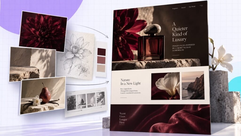
A premium-looking AI website starts with art direction, not a longer “build me a website” prompt. In this workflow, Claude Fable handles the site build while Higgsfield supplies the visual assets. Five focused prompts keep the brand, imagery, motion, and layout consistent.
Quick answer: Create a brand kit first, generate reference images second, make the hero video third, load a web-design skill fourth, and ask Claude to build the site last. Review the output locally before publishing.
The walkthrough below shows all five prompts in one build, from brand direction through the final site review.
The five-prompt workflow
| Prompt | Output | Why it comes here |
|---|---|---|
| 1. Brand kit | Colors, type, mood, audience, positioning | Every later asset needs one direction |
| 2. Reference images | Product and lifestyle anchors | Prevents random visual styles |
| 3. Hero video | Short cinematic motion asset | Motion follows the approved art direction |
| 4. Design skill | Reusable layout rules | Gives the builder a quality standard |
| 5. Website build | Working local site | Claude now has the full creative system |
The order is the trick. If you ask for the website first, the model invents its own visual language. Then every image and video feels pasted on afterward.
1. Turn the business idea into a brand kit
Fable asks for the missing brand decisions before it creates the site. Answer them with specifics instead of accepting generic defaults.
Give Claude the offer, audience, price point, personality, and a few visual references. Ask it to create a short brand document with a color palette, typography roles, image direction, and the emotional impression the page should create.
Save that file inside the project. It becomes the reference for every later request, which is far more dependable than trying to remember the exact shade, font pairing, and mood in each prompt.
2. Generate references before final images
Create the hero asset from the approved visual direction. It should belong to this business, not merely fit the dimensions.
Reference images act like guardrails. Create a product-detail image and an environment or lifestyle image that both follow the brand kit. These do not need to be the final assets. Their job is to keep materials, lighting, colors, and mood consistent when you generate more.
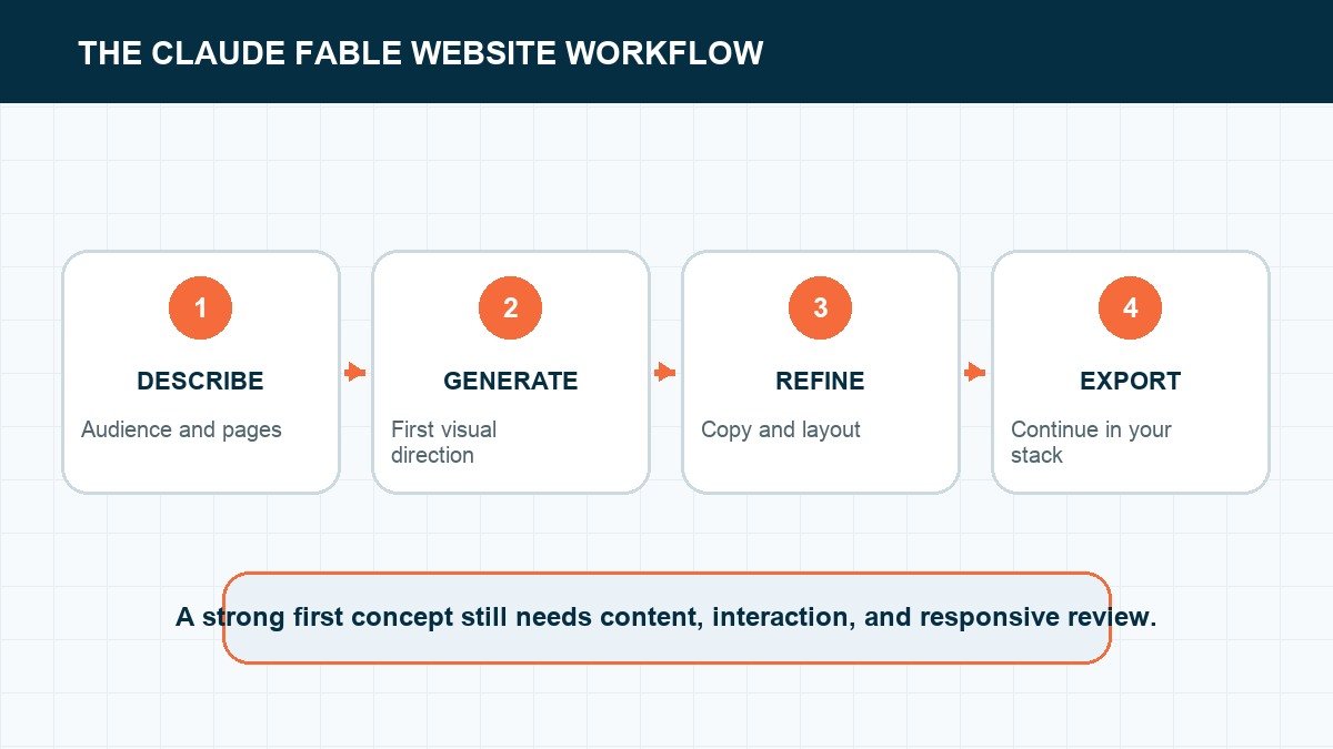
Reject a weak reference now. A bad image repeated across six sections is much harder to fix after the website is built.
3. Give the hero video one job
A hero video should create atmosphere without stealing attention from the headline and call to action. Keep it short, quiet, and loopable. Avoid fast cuts, essential text inside the video, or motion that makes the navigation difficult to read.
Compress the final file and provide a still image fallback for slower connections. On phones, a static image may be the better design choice.
4. Load a design standard before the build
The web-design skill in the walkthrough gives Claude rules for spacing, hierarchy, responsiveness, and interaction. You can create the same kind of standard yourself: define maximum content width, heading scale, button style, section spacing, mobile behavior, and accessibility expectations.
That file turns subjective feedback into checks. “Make it feel more premium” becomes “increase section spacing, reduce competing accents, and keep one primary action above the fold.”
5. Build, preview, and correct the actual site
The first complete preview is where you check the hierarchy, story, calls to action, and whether the generated assets work together.
Now ask Claude to build the page using the saved brand kit and approved assets. Open the local preview and test it like a visitor. Scroll slowly. Click the buttons. Resize the window. Look for cropped text, unreadable contrast, broken media, and sections that repeat the same point.
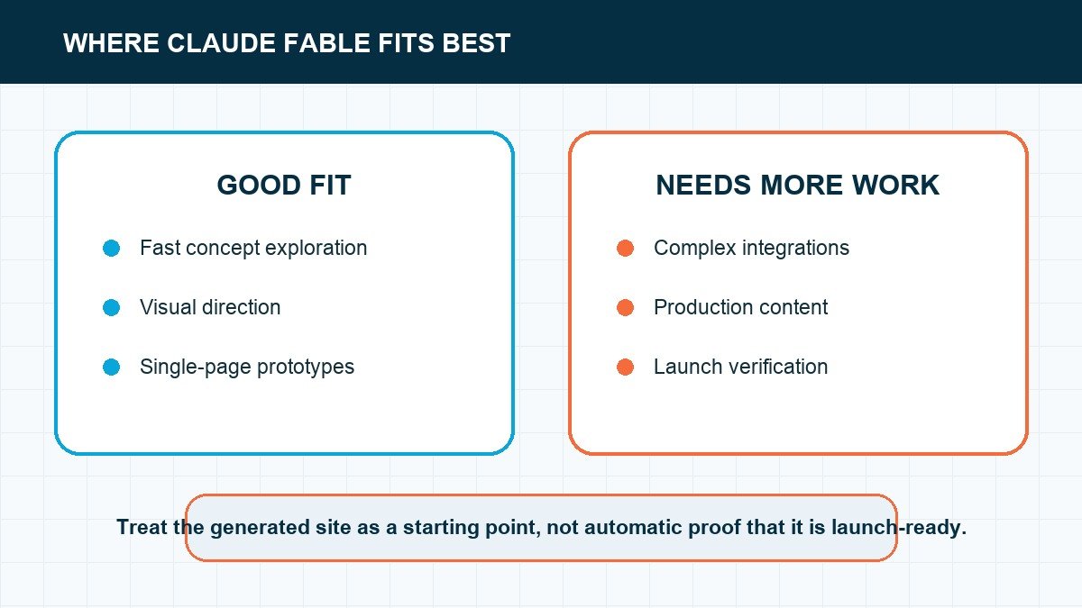
The result shown in the video feels custom because the creative decisions were made before the code. Claude is assembling a system, not improvising a template.
What makes this a client workflow?
- Approval points: the client can approve the brand kit and references before the full build.
- Reusable files: the brand and design rules stay with the project.
- Traceable assets: each image and video has a known purpose.
- Testing: the handoff includes performance, responsive, and link checks.
- Ownership: hosting, domains, source files, and editing access are explicit.
A cinematic homepage is useful. A cinematic homepage the client can own is a business deliverable.
What to put in the brand kit
A useful brand kit is more specific than “modern and premium.” Give Fable a primary audience, a business promise, three to five personality traits, exact colors, typography roles, image direction, and examples of what the brand should never look like.
- Color roles: background, surface, body text, muted text, accent, and button states.
- Type roles: display heading, section heading, body, label, and button.
- Image rules: subject, lighting, crop, color grade, and forbidden stock-photo patterns.
- Layout rules: content width, spacing scale, corner radius, borders, and shadow use.
- Voice rules: audience language, sentence style, claims to avoid, and preferred calls to action.
Save those decisions in the project. If a later prompt produces something attractive but inconsistent, the kit gives you an objective reason to reject it.
Keep the visual assets consistent
Replace temporary material with the client's real logos, photos, and brand files before treating the design as approved.
Reference images should agree on the product, environment, camera language, and color treatment. Generate or select a small approved set before you ask for every section image. Otherwise each prompt can quietly invent a different brand.
Use motion only where it improves the story. A hero video should establish mood or demonstrate the product without making the headline difficult to read. Compress the final file, provide a static poster image, respect reduced-motion preferences, and check how the crop behaves on a phone.
Review the output in passes
First review the page hierarchy: offer, proof, benefits, process, objections, and call to action. Then review the visual system. Finish with technical QA for links, forms, keyboard navigation, contrast, responsive layout, loading speed, metadata, and analytics.
Separating those passes stops you from tuning a shadow on a section that should not exist. It also gives clients smaller decisions they can approve without reopening the entire design.
Use our website design guide to turn the brand kit into a page hierarchy, then source approved assets with the licensing checks in our royalty-free image guide.
Make each prompt prove one decision
The five prompts work because each has a testable output. The brand prompt should produce colors, type, voice, and visual references you can explain. The image prompt should create a usable asset family, not a folder of unrelated pictures. The hero-video prompt should support one message without delaying the page. The design-skill prompt should define repeatable spacing, typography, buttons, and card behavior. The build prompt should apply those decisions to a real page.
Do not move forward because an output looks polished. Write the acceptance test first. A brand kit passes when a second page can use it without inventing new rules. A hero asset passes when it remains legible behind the headline at desktop and phone widths. A build passes when the navigation, primary action, and proof make sense without the prompt sitting beside it.
If you need a baseline for those decisions, use our website design guide. It explains the hierarchy and spacing choices that a generated style still needs to solve.
Separate visual approval from production approval
A Fable preview can earn visual approval while still failing production. Check the real domain, forms, analytics, consent language, image rights, accessibility, page titles, social previews, and mobile navigation separately. Replace invented testimonials, statistics, client logos, addresses, and team details. AI builders are very good at making placeholders feel plausible, which is exactly why the factual pass cannot be optional.
Test every meaningful state. Open the menu on a narrow phone. Submit the form with valid and invalid data. Follow the confirmation message. Tab through links and controls with a keyboard. Check color contrast and heading order. Disable an image and make sure the alt text still explains its purpose. A polished screenshot is evidence of a visual direction; it is not evidence that the site works.
For a broader launch sequence, follow our step-by-step website guide. Use Fable for the creative acceleration, then run the same domain, content, SEO, and launch checks you would use for any other builder.
Package the system so you can reuse it
Save the approved brand kit, prompt set, design rules, asset sources, image prompts, and final QA record together. Name the files by client and version. Record which generated assets were accepted, which were replaced, and which source files the client owns. That package becomes the starting point for the next page instead of asking the model to rediscover the brand.
Turn repeated decisions into templates, but keep the client's facts and visual references outside the generic template. The reusable layer should contain the questions, acceptance tests, and file structure. The client layer should contain the answers. That separation is what lets the workflow move faster without producing the same website for everyone.
Reject polished output that breaks the system
Send a generated asset back when it introduces a new color, type style, lighting treatment, border radius, icon family, or visual metaphor without a reason. Send a section back when the headline does not match the approved offer, the call to action changes, or the layout hides the strongest proof. Consistency is not sameness; it is evidence that the pieces came from one direction.
Reject details that only work in the screenshot. A headline that fits only at one width, a hero video that makes the text unreadable, an image with baked-in copy, or a card that needs exactly three lines of text will become maintenance debt. Test the asset with real copy, a long title, a missing image, and the smallest supported screen.
Stop generating when the accepted system can make the next page. At that point, the work shifts from exploration to production. Reuse the rules and create only the new assets the page genuinely needs.
Keep the source and rights record with every accepted asset. Save the prompt, generated original, edited export, crop, usage location, and any reference material. That record makes later revisions faster and prevents a client handoff from becoming a folder of files no one can trace.
Frequently asked questions
Frequently Asked Questions
What is Claude Fable?
Fable is the Claude model option used in the demonstrated builder workflow. Product names and limits can change, so check the current interface before choosing a model for a long project.
Do I need Higgsfield?
No. It is the visual generation tool used in this workflow. You can use another image or video tool as long as you keep a consistent brand reference and commercial usage rights.
Can this replace a web designer?
It can accelerate production. The valuable work remains choosing the strategy, art direction, hierarchy, copy, accessibility, and quality standard.
Build the creative system first
The impressive part of this workflow is not one model or one animation. It is the sequence. Brand, references, motion, design rules, then code. Keep that order and your AI-built site has a much better chance of looking intentional.