Lies: you’ve got to be some sort of artistic genius or coding wizard with high tech tools to design a website that looks and feels mind blowing.
Facts: With tools like website builders, themes/templates, a basic understanding of website design principles and a bit of practice, it’s pretty darn easy for just about anyone (you included) to design a website that drops jaws.
Especially when you’re armed with a super detailed (yet easy to scan and understand) guide like this one.
Today we’re going over the basics of how to design a website starting… now!
Note: if you want to apply what you learn in this guide to building an actual website but don\'t have one yet, we recommend grabbing a free Wix account or finally get your WordPress website going with hosting and one click install from Hostgator.
What is web design?

Before we dive knee-deep into the process, let’s start with the basics: web design is the process of creating the visual look and feel of a website.
Mostly.
These days “design” also incorporates the idea of “user experience” – which is a whole subject in and of itself, but for our purposes today it means web design isn’t just about how good your website looks, but how easy it is to do things like find information, important links and buttons, etc.
Hence “look” (what people see on your site) and “feel” (how easy it is to use your site).
Websites are built using the coding languages HTML and CSS, which tell a web browser how to arrange all the text on the site, what colors to make things, where to put images, etc.
In the old days, web designers had to hand-code websites from scratch – literally writing every line of HTML and CSS code for each website they made.
These days, you can be a designer without knowing any of that stuff thanks to “What You See is What You Get” website builders (our favorite is Wix) and Content Management Systems like WordPress (which you can get with cheap hosting and one click install from Hostgator).
These website creation tools do the hard work of creating code for you, so you can use your basic computer skills (dragging things around with your mouse, clicking buttons, copy/paste) to make websites. Fast and easy.
What “look” means
There are a few web design elements that determine how good (or bad) your website looks.
Colors

What color is your text? How about the background behind that text? Your header menu? Buttons?
Color is a huge part of making a sweet looking site and a strong part of whether your site looks like it’s supposed to sell expensive watches to business executives or is just a place for your brother to share photos of your nephew’s birthday party.
Fonts

Fonts determine how the text on your site looks. The same words can feel super primo (like the always classy Helvetica) or casual and friendly (#comic sans) based only on the font!
Graphics/Images/Videos

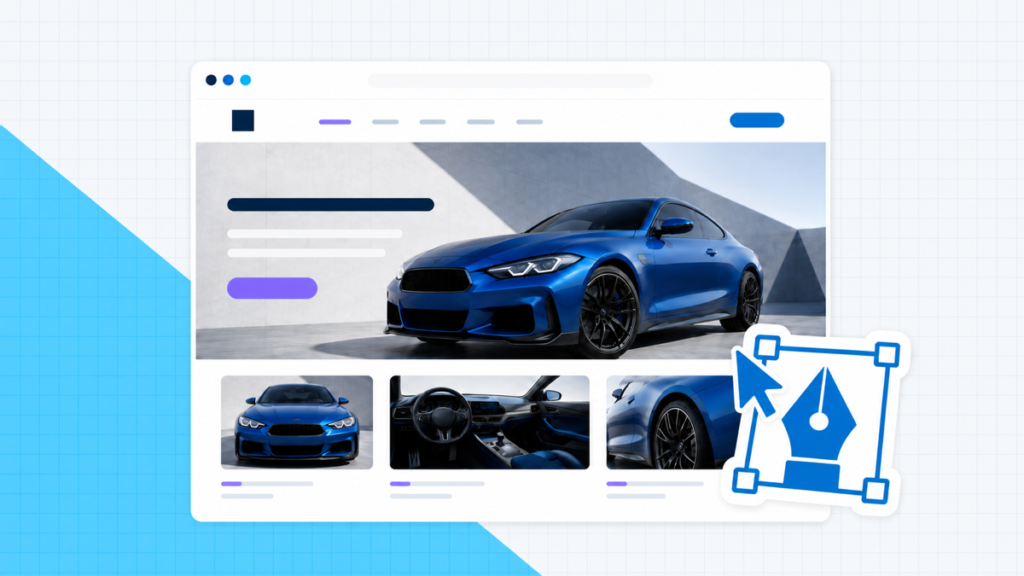
These are things like photos, videos, icons, illustrations (where the whole “image” is drawn in a program like Adobe Illustrator – the cute kitty above being an example!), or composite images (like the “how to design a website” image at the top of this post).
The photos would be taken by a photographer, obviously.
The videos would be made by a videographer if they’re videos of the real world, or an animator if they’re made from other images/illustrations.
And it’s technically a “graphic designer” who would create icons, illustrations, and composite images
But, because there’s so much overlap, many web designers have graphic design/photography/videography skills because there’s so much overlap.
Once you have those photos/graphics/images/videos, the “web designer” is the one who adds them to the site in a way that looks fantastic.
Written Content

Creating content/written text isn’t the web designer’s job but just like with graphic design, some web designers have content creation skills.
On the web design front, “content” is about arranging the words on the website so that they’re easy to read and attract people’s attention when they should (for instance, we wanted you to see the “Written Content” above before reading these last couple of sentences, so we made it higher on the page AND bigger so it’d catch your eye and let you know what this part of the post was about).
But again, because there’s a lot of overlap – and especially if you’re creating your own websites – the person who creates the website design might also write some or all of the content.
What “feel” means
Besides the stuff above, those visual elements that come together with a bit of web design magic to make a site look spectacular, there are a few elements that make a website “feel” easy and dare we say fun to use.
Layout

Layout is the way graphics, text, and buttons are arranged on your page.
Layout not only makes your site look good, but a solid layout also makes it easy to use because information is displayed in a way that makes sense, buttons are in places that people expect them to be, images are placed so that they help people understand what you’re trying to communicate without making text hard to read, etc.
Navigation

This is how people get from one page to the next, and for your more complicated pages, how they get around the page.
Using this very site and page as an example (you’re here, why not), this includes things like
- The header menu (that part with Home, YouTube Tutorials, Written Guides, etc at the top of the page on desktop, or the three stacked lines on mobile).
- The floating table of contents on the top left (if you’re on desktop; if you’re on your phone like most people these days you saw it towards the top of this page, that part smartly called “Table of Contents”).
- The “jump to top” button (the white arrow on the blue circle background at the bottom right of the page).
- The “recently written articles” section at the bottom of the page.
The goal with navigation elements like these is to make it super simple for people to find the pages and information they want, when they want it.
Compatibility

Compatibility is how well your site/pages load and look on different browsers, operating systems, and devices.
Your site will have to look and function a bit differently for a 6” phone screen where people have to tap things with their fingers than it does on a 15” laptop screen where people use their mouse/trackpad (pro tip: if you’re gonna get into the website building game, get yourself a mouse; even Apple’s trackpads are just so much harder to use).
Web design vs. web development

As you’re getting familiar with the world of website creation, you’ll see “web design” and “web development” get thrown around pretty much interchangeably.
At the beginner level, they basically are – both are all about creating websites.
But we’re here to help you slingshot from beginner to expert at SpaceX rocket speed, so we’ll break them down for you a bit more.
Web design, as we got into a bit above, is about what people see and how they interact with your websites – the buttons, colors, fonts, images, page layouts, etc.
Web development is about actually getting into the code, writing the HTML, CSS, Javascript, PHP, etc that form a functional website.
If you’re building websites yourself using website builders or CMSs like WordPress, you’re basically both in a sense (even if you don’t write a lick of code).
As you get more advanced, you might want to build some samurai level skills in web design or web development.
Or you might want to hire someone to help you with certain parts of your website creation process.
So here’s a bit more in-depth into the differences between a web designer and a web developer.
What is a web designer?

Again, simply put, these are the folks that make websites look good and feel easy to use.
But in the world of big-shot websites like Amazon and Google, and maybe your sites one day, there are actually a couple of different types of “web designer.”
User Interface (UI) Designer
At the top levels of the website building game, UI designers are dedicated to just the visuals – the colors used, the fonts used, what images are used and where, the size and location of text, etc.
Just the visual “look,” the aesthetics, not any of the “feel” stuff.
So when a lot of people say “web designer” this is usually what they’re talking about…
User Experience (UX) Designer
But there’s another end of things in the web design world – the “feel” of your website.
When you’re getting started, and to be honest for a long time and a lot of sites after that, you can just stick to pre-built templates and some standard design forms to determine how things work on your site, where buttons go, where to use navigation menus and elements, etc.
For example, your site should have a header menu for your main pages (contact page, about page, home, blog, etc). Any website theme or template will have these, and just from using the internet you know header menus are a thing your site needs to have at the top of the page.
But deeper into the game, you start to ask questions like “what pages should actually be in that header menu?” “Should I have a button for my contact page in the header menu?” “Should the menu stay at the top of the screen and disappear when I scroll down or stay floating above the content?”
UX designers ask these questions, then do user research and testing to figure out the best way to layout your pages, which exact elements to include in order to get the most people to find your site fun, engaging, and maybe even a little bit addictive.
What is a web developer?

Again, these are the folks that make the actual code that runs turns a web design (“here’s what text goes where, with what font, in what size; here’s where the buttons go and they should be this color” etc.) into an actual website.
And, again, when you’re getting started out, you’ll use tools like website builders and WordPress to handle this end of things for you – so you’ll be doing the “web development” as you’re doing the “web design.”
When you get more advanced, though, sometimes you’ll want things to look a certain way that you can’t find in a template or can’t make happen with a web builder’s toolkit or WordPress plugin.
When that’s the case, you’ll need someone who understands code to make it happen – or become one yourself.
At that point, you’re definitely winning.
And at that point, you’ll need the help of one of three kinds of web developer.
Backend developer
Backend developers are the guys and gals that work on the core structure of a website.
They use languages like Java, SQL, and C++ to get certain information from databases, load a page when a button is clicked, send a new entry from one of your contact forms to a program like MailChimp so you can do some email marketing.
Basically, if it has to do with something that makes your website work but isn’t directly tied to what your visitors see, it’s a backend developer’s job.
Frontend developer
Frontend developers make the HTML, CSS, and Javascript that makes things visitors to your site see.
You need a button here? A frontend developer will add that to the code.
Need this contact form to have name, email, and message fields? A frontend developer will make those fields appear on your page and able to accept text from someone (but it’s the backend developer that makes sure that data is received properly on the server, and sent over to Mailchimp).
Full-stack developer
Now that we know about frontend/backend developers this one’s easy: a full-stack developer is just someone who can help with both ends of the “web development stack.”
Do you need to hire a web designer or web developer to help you create websites?
Short and long answer: nope!
Especially when you’re getting started, tools like the best website builders (we love Wix) and CMSs like WordPress (get it cheap and easy with one click install from Hostgator) make it easy for anyone to create websites without having to spend a ton of time and years building experience in the finer points of web design or learning how to code.
When you get to a certain point, you might need a designer or developer to help out with some more advanced things you want to do.
But you can absolutely build some amazing looking sites without the help of these experts.
And, thanks to resources like this here blog post and our Youtube channel, you can learn to do a lot of web design and development things yourself!
Which leads us nicely into our step-by-step guide on how to design a website…
Step 1: Define your site’s purpose

Yep, the first step in designing a website is a bit of a philosophical one: what are your reasons for creating the site at all?
Do you want to create a blog that gets millions of fans and readers?
Have an awesome online business idea to get some sweet sweet time and financial freedom that you just can’t have with a day job?
Are you learning to build sites so you can make money as a website creator for other people?
Whatever your reason for wanting to learn how to design a website, each website you create has to start with a purpose, a “raison d\'être” as the french or people trying to be way too fancy would put it (#guiltyascharged).
Why you ask?
Well, if you’re new to website building, it’s super easy to overthink it; there are hundreds of blog posts on how to build a website, how to start a blog, how to make money online, etc. etc.
All sorts of ideas on what you should do to create an online business, what features you should have on your site, what tools you should use to make one.
Knowing why you’re building a website and what it should do can help you make decisions about what the design you create needs to have – and what’s #extra.
Plus, if you’re not clear on what the website should do/be from the start, you can end up with a “frankensite” that’s some sort of grotesque and confusing patchwork of 100 ideas you’ve had over 100 weeks of website building.
So to help you get clear and off on the right foot with your website design, we have three things for you:
- A list of general questions to answer about the website you’re designing
- Some insights into the 3 basic objectives a website can have
- Some examples of the types of site you might be looking to build
First, those general, get your Buddhist monk/Einstein on questions:
- Why do you want a website?
- What does a “successful” website look like to you?
- Who do you think your audience/visitors are?
- What do they gain by coming to your site?
- What do you want them to do once they get to your site?
- How does your website idea compare with others?
- Are you aiming to make money from your site?
That last one leads us nicely into:
The 3 main website objectives
At a high level, a website can basically do three things for you:
- Establish your authority
- Generate leads
- Sell products
The first one is probably the simplest – a few relatively basic pages and a blog is all you’ll really need; you can get more fancy from there but those are the essentials to let people know what you’re about and connect with them enough that they’ll want to hear more from you.
The second, from a technical standpoint, is a bit more complicated but not by too much.
Without going into a whole business lecture, basically by “generating leads” we mean one of two things:
- You’re selling a particular service (like graphic design or web design for example), and you want people to be able to come to your site, decide they want to work with you, then have a way to get started.
- You’re building an affiliate website, where you want to attract people who will read your content, then click on links to products that they’ll then buy and you’ll get paid a commission from.
For these sites, you’ll need to think a bit more about what kind of people you want and need to attract (which is largely a marketing question but will affect your design as well), and what you’ll need to show and tell them so that they’ll want to click your affiliate links or fill out a form to work with you.
The third is the most complicated – in addition to some basic pages describing what your site/business is about, a blog, and some thought about who you need to come to your site and what you’ll want them to see when they get there, you’ll have to create ecommerce pages and functionality so they can buy products from you.
6 types of websites
Those three basic objectives can translate into a few different kinds of sites, each of which will affect the functionality and aesthetics you’ll need to consider when designing a website (though any of these can be built with a builder like Wix or with WordPress hosted by an awesome company like HostGator).
Here are a few examples, for your consideration (insert broad, sweeping gesture here):
Blog

The heart and soul of a blogging website (like this one) is the almighty blog post (like this one!).
They’re generally informative and hopefully entertaining, there tend to be a lot of them, and more will be added faster than you’d add a new page to another kind of site.
You might have a blogging site that just shares your personal thoughts and adventures like fifty coffees.
You might have a blog that teaches people some skill you have (like this one!).
You might have a blog that makes money, or maybe it’s just for your own personal satisfaction (and that of at least a few visitors).
Other kinds of sites might have a blog, but your site’s whole reason and purpose might be the blog itself too.
Portfolio

A portfolio site is primarily meant to describe the work you do and showcase some examples and case studies of that work.
A few awesome examples of this:
Most of the time these are for people with creative skills, though they could be a sort of online resume for someone in just about any industry.
A lot of times, they’ll have at least a contact form that could be for lead generation, but unlike a business site built specifically generate leads (that would have things like “downloadable guides” and pop-ups asking to “sign up for the email list”, that might be it on the LG front.
And sometimes these sites have blogs, other times they’re just relatively static pages that get updated every once in a while.
Brochure

Brochure websites are similar to Portfolios in that they’re largely informational but might have some lead generation features and/or a blog.
The difference is that Portfolios are sites for individuals, while Brochures are for businesses, groups, and nonprofit organizations.
Which means they’ll have a slightly different set of core pages; where a Portfolio site would have examples of work you’ve done, a brochure website would have a menu or upcoming events page; where you might just have a simple contact form on a Portfolio site, a brochure site might have locations and business hours as well (maybe no contact form either – no one needs to email that hot new gastropub asking about their daily specials).
Examples of solid brochure sites include:
- Le Garage (restaurant)
- Bergmeyer (architecture firm)
- IxDA (design industry group)
- Operation Groundswell (nonprofit)
The lack of need for real lead generation considerations is what separates Brochure sites from business from our next category; restaurants don’t really need lead generation, nor do some nonprofits.
On the other hand…
Professional Services

Professional services sites might include law firms, web design agencies, hotels, real estate agencies, etc.
Basically, if a site needs to tell a business’ story and provide information that persuades people to want to work with that company, it’s what we’d call a “professional services” company.
They’re not necessarily selling products through an ecommerce store, though there might be some level of ecommerce functionality.
The “customers” these sites are trying to get will need to talk to a real person at some point, schedule an appointment, maybe book online.
These sites aren’t “ecommerce,” though, because visitors either won’t be paying through some sort of “buy now” function or if they do, what they’re paying for isn’t simply a product that gets shipped or emailed to them.
Examples:
- YLaw Group (law firm)
- Gramercy Park Hotel (hotel)
- Ormsby Real Estate (real estate)
Ecommerce

This one’s easy because you definitely know this kind of site – Amazon.
But, Amazon’s not the only name in the ecommerce game, there are a ton of (much) smaller businesses that have websites to sell their products directly, without the help of third-party websites like Amazon.
The point of these: get traffic, make sales.
Some examples:
Step 2: Choose your website platform

Alright, once you’ve got a basic concept of the purpose and type of website you’re building, it’s time to choose your “website platform.”
What the heck does that mean?
Well, you’ve got to get this website built (hopefully without having to know too much about coding), connected to a domain name, and hosted on a server so people from all over the world can get to it.
Technically, there are a lot of ways to do this.
Realistically, there are two main ways:
- Website Builders (like Wix)
- WordPress (hosted by a company like HostGator)
Website Builders
Website builders are tools that let you go from 0 to website super fast.
They take care of the domain and hosting parts for you, then offer a drag and drop interface to let you build your site page by page, button by button – without having to code or mess with the technical parts of building a site and making it available on the internet.
If you want the simplest website building process possible and don’t mind paying a few extra bucks over option 2, this is the way to go.
We’ve got a whole definitive guide to the best website builders for you right mere, in case you don’t want to all the way in atm a few of our favorites:
Wix
Best All Around
Wix is what we’d like to call “the website builder’s builder” – it really sets the standard for everyone else.
It’s not the cheapest and because it’s so customizable there’s a bit more of a learning curve.
But if you’re going to fully dive into the world of website creation, you won’t go wrong here.
Check out our full Wix review here.
Gator Website Builder
The cheapest… and that’s not a bad thing!
Bottom Line
We fully believe a good website maker is worth paying for… especially when it’s less than $4 a month!
Gator is certainly the choice for the price-conscious website building beginner, but it’s also powerful and easy to use so you won’t be disappointed as you become a website creation wizard looking for a website creator you can grow with.
Check out our full Gator Website Builder review here.
Constant Contact Website Builder
The best website builder for small business
Constant Contact makes it super easy to make a professional website that looks great, with just enough customization to make your site unique without extra features that take time to learn.
Combine that with one of the best email marketing platforms around and a $10/month price tag and you’ve got a website creator perfect for a small business owner who wants a solid website without having to spend a lot of time or hard-earned cash!
Check out our Constant Contact website builder review here.
WordPress

The other main platform for designing, building, and launching websites is WordPress.
It’s a “Content Management System” (CMS) that makes it easy to create and customize sites without knowing how to code.
There are, technically, other CMSs besides the good ole WP, but WordPress is by far the most used and for good reason – it’s just a hands-down, no jokes, solid product.
WordPress itself is 100% free to use, which is pretty awesome.
You will have to pay for hosting and a domain name, though, but the total will be cheaper than using a website builder (especially when you get our up to 61% discount and free domain through HostGator!).
The tradeoff: there’s more work to be done.
You have to set up your domain name and hosting, which builders take care of for you.
And, while WordPress is way more customizable and flexible than website builders, that comes at the cost of a bit of a higher learning curve, unless you use a drag and drop WordPress website builder plugin like Divi.
Check out the full lowdown on “what is WordPress” here!
Step 3: Choose your template or theme

Alright, now that you’ve got some clarity on the purpose of the site your building and the platform you’re gonna roll with, it’s time to choose your template or theme.
The two terms are basically interchangeable, it mostly depends on the platform you’re using.
Some nuanced differences aside, a theme or template basically covers a lot of the groundwork on in the looks department for your site by giving you an initial layout and set of colors to work with.
It’s like the structure of the house that is your website – the basic walls, rooms, colors are there, you’ve just got to fill it in with furniture, repaint a couple of walls, maybe swap out the toilet or add some recessed lighting in the kitchen.
Whichever platform you use, you’ll find a range of templates/themes – organized by the type of site, certain features, particular industries – that you can preview to find the best starting point for your site.
A couple of notes before we get into some tips on choosing the best template or theme for your site:
- Some themes/templates come with a set of pre-built pages, so things like your homepage, about page, and contact page are already started; others will just give you a few standard colors/fonts and types of page layouts, then you’ll have to create the pages you need from that starting point – these are a bit more work, but you still get a head start over the people doing it all from scratch.
- Themes and templates for the best website platforms are all customizable, so you can make your site look exactly the way you want to, but it can be helpful to find one that’s got 70-80% of what you want already built out – saves you some time adding/rearranging things later.
Our Favorite WordPress Themes
If you\'re going WordPress in your big ol\' website creation and design adventure, we\'ve got a complete list of the best WordPress themes in this post.
Here\'s the quick and dirty if you\'re more in the doing than reading mode at this point:
Tips for choosing a website theme or template
Keep it simple
This is where it’s really important to know the purpose of your site.
Some themes come with a lot of flashy animations, complex layouts, and tons of built-in features that can all seem really impressive when you first see them.
But these things can distract visitors.
They can make it more complicated to customize your site.
And they can slow down your site.
So start with the basic features and functions you’ll need to fulfill your website’s purpose.
You can get double backflip fireworks grand finale fancy later.
Check out the competition
Especially with your first few sites, this is a hugely helpful place to start.
Because until you’ve got a few sites under your belt, you’ll probably have a tough time brainstorming ideas for what you want in your website designs, and you might just have zero idea why you should choose one template over another.
So, start with what’s already working for people making similar moves, check out your competitor’s sites, make some notes about what you like and don’t like, then use that to find that badass template you’re searching for.
Be careful not to feel like you have to do everything your competitors are – they could be working with much bigger budgets and they’ve been working on their site for longer than you have.
Just look for some basic good/bad pieces and keep moving!
Pay attention to fonts and colors
We’ll get a bit more into fonts and colors in step 4 below, but this is a big part of choosing a template.
Again, customization is always possible; if you find a theme that’s got the perfect layout but the button colors are terrible, go with it and change those later.
But that can take some work, depending on the website platform and particular template.
So look for something that uses a set of fonts you can at least live with if you don’t absolutely love them.
And pick one whose overall color scheme is close, if not spot-on; if you’re building a super fun and bright kids clothing store, don’t choose a template that’s mostly black, white and grey.
Likewise, if you’re building a site for a law firm, probably best to leave the pastels and comic sans behind.
Keep mobile in mind
You’re probably reading this post on your phone.
How in the world would we know that?
Because most internet traffic these days is from mobile devices.
And we’ve got Google Analytics data that says most of our visitors fit that bill.
In your web design journey, you’ll come across other posts that remind you to “make sure your site is mobile responsive.”
“Mobile responsive” meaning your site shows up one way that looks fantastic on desktops, and automatically shows up a different way (that also looks fantastic) on mobile devices.
We agree, your template should be mobile responsive.
Where we disagree is in “making sure your template is mobile responsive.”
Everyone’s known that’s important for years; any template or theme you choose will be responsive.
So “keeping mobile in mind” isn’t so much about checking to see if the theme you love is mobile responsive at all, it’s about checking that out before you choose.
Some platforms will have a “mobile view” in their demo so you can see what the template looks like on smaller screens.
A hack if that’s not available: just resize your browser window to the smallest width you can.
Just because everyone else mentions “SEO”
Again, like “mobile responsiveness” this isn’t a thing to worry about too much.
SEO (“search engine optimization”) has been important for a while, so any website platform, theme, or template you choose will have SEO in mind.
There are some particular things you’ll want to look for but that’s for another post and a later stage in your website building journey.
So for now, just know you don’t really have to worry about this; whatever theme you choose, you’ll be fine.
Step 4: Choose your initial branding

It’s just about time to start getting your hands dirty with some in the weeds page building and website designing, just one more “let’s think about this first” step – choosing your initial branding.
Branding is a big topic, but from a beginner’s standpoint, this basically means the colors and fonts you’ll want to use on your site.
“But wait, shouldn’t I figure out the fonts and colors before I choose a template? Won’t that change what template I choose?”
A smart question to ask. And no, you shouldn’t.
Well, you can but you don’t need to.
Why?
Because when you’re getting started, figuring out what the branding should be is pretty hard; there’s a lot of experience and practice that goes into really understanding the best colors, fonts, and overall style a website should have, why Helvetica would be better than Times New Roman, why burnt orange is a better brand fit than fire engine red.
That’s where taking a look at what the competition is doing is helpful; if they all use a lot of dark backgrounds and sans serif fonts, you probably should too.
Likewise, if you really like the look of a particular theme, it’s going to include certain fonts and colors anyway.
Maybe you should change those, but you might not have to.
So by choosing a theme first, you can provide a bit of structure to your “what’s the brand” decision making, instead of a world of options (which can be confusing and time-consuming to navigate), you’ll just have a few good options that are perfectly great starting points.
That being said, color and fonts are important parts of designing a website.
So let’s go over a few basics about each.
Website Color Schemes

Color is a huge part of defining your website design and overall brand.
There’s a ton of psychology behind what colors mean and which colors are best for your website and the business it’s representing.
There are whole books and websites covering the topic of “color theory,” but we’re here to save you the hours it’d take to read those.
As with so many things, we have a big ol\' website color schemes guide here.
Short version…
Here are the basics of what colors mean in relation to branding and websites:
- Black represents luxury, power, elegance, and sophistication.
- Gray represents simplicity, neutrality, logic, and “the future.”
- Red represents urgency, excitement, danger, and passion.
- Pink represents sweetness, femininity, innocence, and romance.
- Yellow represents optimism, cheerfulness, and youth.
- Orange represents creativity, friendliness, and enthusiasm.
- Purple represents success, wisdom, wealth, and royalty.
- Green represents health, wealth, peacefulness and nature.
- Blue represents security, stability, trust, and calmness.
Cool, but how do you choose the colors for your site?
Well, most brands have one dominant color, then two or three secondary colors and a background color.
You’ll want to think about your audience, too – don’t just choose your favorite colors, choose ones that will communicate well with the people who will visit your site.
Building a site for a classy (aka expensive) restaurant? Black, red, and purple are good starting points.
Building a site to sell baby clothes? Blue, pink, or yellow could be the move.
Maybe it’s a portfolio site for your website creation services. Gray, blue, and orange are solid there.
Once you have a general idea of what dominant color is best for your target audience, it’s time to give Adobe’s Color wheel a spin.
It’s a 100% free tool that will let you pick your dominant color, then it’ll automatically suggest secondary colors for you.
And it’ll give you the hex codes (like “#231885”) which are what you’ll use to tell your website builder/WordPress exactly what color to use in certain places (rather than relying on your eyes to try to match – that’s just not the pro move lol).
Once you’ve figured out your color scheme, how do you use it on your site?
The dominant color should be used in most important parts of your site like:
- Your logo
- Menu tabs
- Call to action buttons
- Backgrounds for important information
- Headlines
Your secondary colors should be used as accents in places like:
- Subheadlines
- Backgrounds for information that’s important, but not the most important
- Hover effects
And your background colors, which might be white, gray, black, or one of the secondary colors you got from our friends at Adobe, should be used in… the background.
Duh. More specifically/helpfully:
- Use lighter color backgrounds when you want the words and images of a section of your page to stand out.
- Use darker colors/your secondary colors to help create some distinction between sections of your page; use these a lot/instead of light or white backgrounds if you really want to push your branding on your website.
Website fonts

After color, fonts are the other big way your initial branding will apply to your web design.
Is your website going to cover serious business? Then classic, classy fonts like Baskerville and Arial are the move.
Looking to do something more fun and lighthearted? Copse or Museo are a good place to start.
One important thing to keep in mind when choosing a font for your website design: make sure they’re readable.
There are some super classy script fonts that are nice for wedding invitations but are just terrible for websites (we’re looking at you Buttermilk; because we can’t tell what you’re saying and we don’t know why that’s your name).
Also, you’ll want 2, maybe 3 fonts for your site max: a primary font (for headlines) and one or two secondary fonts (for your subheadlines and body text).
Cool story, we know, but how exactly do you choose the right fonts for your site?
Well, like we mentioned above, this is where choosing a template first is helpful; you’re probably good to go with the fonts they included by default.
If you want to choose new ones, that’s gonna take some time and exploration.
But to help you get started, here are a couple of handy infographics from our friends over at DesignMantic:


Step 5: Create your website layouts and initial pages

Awesome, now we’re getting into the dirty dirty, hands-on stuff – it’s time to get your initial website pages created.
First up, you’ll want to start simply with a few key pages any website will have.
From there, depending on your site’s purpose and the particular business you’re building it for, you’ll need more.
BUT any site you’re going to make (whether you use a builder like Wix or WordPress/HostGator hosting) will have the following:
Home page

For the record though we’re 99.9874% sure you already know this: the homepage is the main page of a site, the one you land on when you go to “thewebsite.com”
Every site has one, and it’s almost always the first thing most visitors see.
A few tips on designing homepages:
- Be sure to use lots of attention-grabbing visuals.
- If this is a lead generation or ecommerce website, be sure to include at least one “call to action” or CTA – either something like “contact us for a quote” or “shop now.”
- If the business has some sort of testimonials or trust badges (like “BBB accredited”) stick those bad boys on there.
- Make sure there are easy to scan and read sections that communicate what the business/organization/person does and why visitors should care.
- Include contact information or an email list sign up form if those are part of the website’s purpose.
About page

We’re also pretty sure you know this page too.
It’s where you tell the story about the business/organization/person who’s website people are reading.
Definitely include images of the people behind the site/business.
And be sure this page answers the following questions:
- How did the business/organization get started?
- Who is the site for?
- What makes this site/business different?
Contact page

For lead gen sites, this is definitely one of the most important pages, though pretty much every website should have one of these as well.
Make it easy for potential customers or visitors you might want to connect with to reach out with at least a contact form.
Bonus points for including links to social media accounts, phone numbers, and physical addresses.
But only include these if they make sense (if this is a portfolio site, please don’t put your home address out there for anyone in the world to find – you will get more spam mail and maybe a visit from an overly enthusiastic fan).
Product/Services/Portfolio page(s)

The last of your core pages is really a type of page because it depends on the goal of your site/kind of business or organization it is.
These are portfolio pages that show examples of work, product pages where people can buy things, or services pages where people can learn more about what the business whose site your building does and can contact someone to learn more/get the service.
You’ll definitely want to include lots of relevant information about the product/service/work example, along with some super slick imagery that helps visually communicate the what, why, and how.
And if we’re talking about a product or service page, pricing info is important (though many services pages don’t have this because the cost can vary depending on the project), as is checkout functionality for product pages.
Web page layout best practices

When it comes to the actual layout of your particular pages, your theme or template will help define a lot of this for you – it’ll put the headlines, images, body text, forms, buttons, etc in certain places out of the box.
But maybe you don’t quite like some of those choices.
Or your the type who just really likes to tweak things so they’re more “yours.”
Well, we like that kind of creative spark.
Just don’t screw up your site for the sake of changing things around.
A good website and web page layout keeps people on your site because it makes important information and features easy to find.
Bad layouts are frustrating and make people jump away from your site faster than your alcoholic uncle consumes a 12 pack of Bud Light (no disrespect uncle Jimmy but damn dude, chill).
Some general elements of a good layout:
- It’s intuitive – visitors shouldn’t have to think hard to figure out what they should look at/do.
- It’s streamlined – no fluff or clutter, just the minimum amount of text and imagery needed to get your point across.
- It’s goal-oriented – want people to click a buy button? Make it bright and well separated from other parts of the page; want people to look at a particular image? Make it big and right smack dab in the middle of the page.
- It’s designed for skimmers – most people just don’t want to take the time to read every word on a page (if you’ve read every word of this post so far you’re an everyday hero for sure), so use plenty of bullet points and headlines to make it easy for people to see/read the most important information fast.
Website layouts that work
There are a ton of design principles to learn if you want to master the whole “how to design a website” topic.
But to get started, you can definitely get a solid website built by just going with what already works for thousands of other sites.
There are a few standard layouts that pretty much always work, so if you apply these to your pages you’re just about guaranteed to be good to go.
“What you see is what you get” website builders like Wix will def make it easy to implement these however you want; when it comes to WordPress a drag and drop theme/builder like Divi is the way to go as other themes will have more limited options for customizing layouts.
The F

This is the most fundamental website layout around as it’s how people have been reading books (in English at least) for centuries – start at the top left of the text, read to the right, jump back to the left of the second line of text, move to the right.
Aptly named as this makes people’s eyes look at a page in the shape of an, you guessed it, “F.”
This one won’t fail you though because it’s so standard, it’s not very exciting.
Use it as a default layout to lean on but mix up your pages with sections that use other layouts too.
The zig-zag

This is the old left text, right image -> right text, left image -> left text, right image trick you’ve seen on hundreds of sites.
“Zig-Zag” because your eye “zigs” then “zags” across the page in the shape of a Z.
People are so used to looking at web pages like this, it’s a real winner for creating a layout that’s a bit more interesting than the tried and true F layout but easy to understand.
The featured image

The featured image is another web design standard – it puts an image, big and bold, towards the top of a page to really hit home on what that page is about in a super visual way, usually balanced out with some text, as opposed to…
The full-screen photo

Just like it sounds, whether at the top or some section below that, this is a part of the page that lets an image take a leading role in communicating some key idea you want to get across about your site or the people it’s for.
The full-screen photo is a cool way to make a background more interesting than just using a color (be sure your text is still readable though).
Or you can put the words on hold for a bit and just let people take in the full glory of a photo that’s, simply put, freaking awesome.
Grid

Whether images, text, or both, grids are a good way to let people easily browse a lot of information in a short amount of time.
By equally distributing content, they let visitors to your site choose what they want to look at first, second, third, or not at all.
Step 6: Create, find, and add in your content

Alright, you’ve got your initial pages built and laid out, time to add in the content – the words, images, and maybe videos that will make this website masterpiece complete.
Some more technicalities because we like them and they’re useful for you to know:
Finding images/graphics to include on a website is a thing most “web designers” would do; actually taking photos or creating graphics is technically the job of a photographer or graphic designer, but in the website creation world a lot of web designers might do those things too (because they’re such an integral part of building a website.
Likewise, creating the words for a website is technically the job of a “copywriter” (it’s an old advertising term, where the words of an ad are called “copy” instead of just “words” because that’s not very catchy).
But, again, a lot of web designers write copy (“website words”) too.
We definitely don’t have the space to do complete guides on copywriting or graphic design or photography here.
But, for the sake of helping you get to a finished website, here are some tips on writing words for websites and finding images/graphics to include.
Writing copy for websites

Note: If you\'re not a huge fan of writing, you can find some solid “website copy” and “website content” writers on Fiverr, but even if you decide to have someone from there write for you, it\'s good to know the basics so you can check their work!
Know your target audience
Just as your brand colors and fonts should match who you’re trying to speak to through your site, so too should the copy.
Having an idea of who your ideal visitor, the “target audience” for your website is important for understanding what copy you should write, what words you should use, what information you need to have.
For example, we know a lot of the people who come to our site are towards the beginning of their website creation journey.
So we use the words “getting started” and “as a beginner” a good bit.
And we also aim to filter through the details and deep levels of technicality involved in completely understanding how to build and launch websites to give you information that’s going to actually help you get started.
You probably don’t know what an htaccess file is. You don’t need to when you’re getting started, so we don’t mention them when talking about hosting.
Understanding your target audience, the people who are going to read and take action on your site goes beyond demographics like age, gender, location, etc.
You want to know what problems keep them up at night, the kinds of words they use, what they dream of achieving.
This all will help you figure out what your site needs to say and when it needs to say it.
Know the features, benefits, and objections
This one’s for lead generation or ecommerce sites in particular.
You know what products or services you’re selling – you should write about those obviously?
Not quite.
The cold hard truth is that most of the people who come to the site you’re building aren’t your mom; they don’t really care about you, your company, your products and services.
They’re interested in themselves.
Their problems. Their needs. Their dreams.
The stuff you’re selling is just a means of solving those problems, meeting those needs, and achieving those dreams.
So you have to talk about the benefits – what people get out of buying your stuff or getting your services.
And you have to address the objections they’ll have about whether or not you can deliver those benefits.
The high level of figuring this out:
- Make a list of features of the products/services being sold through the website
- Translate each feature into a benefit your target audience wants
- Write down objections people will have about buying those products/services
Then make sure you talk about those benefits and address those objections in the copy, particularly on your home page and product/services pages.
Put the important stuff at the top
Writing website copy is kind of like fishing – you want to put the juicy bait you’re using right where you need to hook ‘em.
In the case of your website’s pages, that’s right at the top.
If you don’t get your visitor’s attention and interest in the first couple of seconds that they’re on your site/page, right at the top, they’ll leave and find one of a million other things to do on the internet (cat videos and Instagram are probably at the top of that list).
So when you’re creating copy for your web designs, be sure to put the juiciest details and benefits as close to the top (if not at the actual top) as you can.
Don’t try to sound smart or use jargon
When a prestigious, highly intellectual publication like Harvard Business Review suggests we should stop trying to sound smart, well we here at CaPW take note.
Their reasoning: instead of impressing readers, you alienate them; they feel like you’re trying to put yourself above them.
And on top of that, big words and phrases like “these pros are sophisticated and eloquent” just take more time for people to process and understand.
They can be confusing, and in the super distracting online world, people have more fun things to do than being confused reading your website.
So keep your words simple and clear.
And try to avoid using insider terms/jargon that your readers might not understand, or explain what those words mean if you have to use them.
Eg we wanted to make sure you knew WordPress was a CMS further up this post – but explained that meant “Content Management System” and those are basically a way to make websites without having to write code.
We like to use tools like Grammarly and Hemmingway app to figure out if our writing is too complicated – and you should too!
Keep it friendly
This one’s a riff on the last tip.
In a lot of cases, it’s best to write like you would speak – using “you,” contractions (words like “can’t” instead of “cannot” for those of you who don’t remember English class – we feel you), and the occasional slang.
For some business websites, this kind of language isn’t entirely appropriate (most law firm websites shouldn’t include any “sup y’alls”), but in a lot of cases it’s best to just talk to your readers like people instead of some stuffy, stick up his butt accountant for a fortune 500 firm (apologies to the corporate accountants out there that know how to get down).
Finding images and graphics for your website
Website images are powerful stuff.
Simply swapping out an image can have a huge effect on changing the look and feel of your site, and that can be done in a few seconds for little to no money, no super-advanced coding or design skills necessary.
But how do you find and choose some sweet images for your site without spending a ton on professional photography or custom graphic design?
Some tips and a list:
Tip 1: Go high quality

This is hopefully obvious but just to be “clear” (get it, because we’re talking about images… this is why we’re not professional comedians): don’t use fuzzy or pixelated images on your site.
Image resolution is a balancing act on websites because super high res images will slow your page loading down.
But you want to make sure you use images that are at least as wide/tall as the space you’re trying to fill on your site (eg, if you created a page that has a 1020 x 870 pixel spot for an image, don’t try to stretch a 750×420 image to fit).
You can also use images that are bigger than you need, but be sure to use a tool like Optimizilla to compress your images to the smallest possible size without losing quality.
Tip 2: Go unique
When you’re starting out, stock photos are going to be your go-to because custom photography (good custom photography at least) is expensive.
But you definitely want to look for something better than the classic “man in front of a laptop, wearing a button-up shirt, looking at the camera holding a cup of coffee” photos that are the stuff of terrible websites from the ‘90s and memes.

We feel your pain, Harold, for so many reasons.
There are definitely interesting stock photos to be had out there that might not be 100% unique to your site but at least won’t leave people feeling like your mom made your website 10 years ago.
See our list below for places to find these!
Tip 3: Images should have meaning

There are enough people in the stock photography trenches that there are loads of well-composed, high-resolution images to be found out there.
But you shouldn’t just slap a photo on your site because it looks good. Your images should help communicate the message you’re trying to share on your page.
If you’re looking for an image for a legal services page, you could find an image of people in suits shaking hands, suggesting “we’ll help you get your legal troubles solved.”
Or for a thought-provoking blog, you could use a shot of a mountain or a sunset over a field of wheat.
Okay, those ideas are borderline cheesy, but the point is you want your images to evoke feelings and help tell the story you’re sharing on your website either directly or in an abstract way.
Random puppy photos are cute but not right for most sites.
Tip 4: Faces are good

People are a special thing. #deepthoughts
r/iamverysmart jokes aside, there’s a lot of psychology behind the power of eye contact and faces in marketing/web design.
People are naturally drawn to faces on a deeply animal level, so be sure to leverage that to keep people engaged with your web designs by having at least one or two friendly faces somewhere on your site.
Where to find images for your site
There are boatloads of places to get super sweet imagery for your web designs, some are free and some are paid.
Do you have to pay to get solid photos?
Not at all. The images in this post are mostly free (we made some ourselves and pay people for their help with that).
Paying for stock photos these days isn’t so much about getting quality images.
But if you pay for an image, it’ll be a bit more unique because most people stick with free thanks to all the free stock photo sites out there.
And you might find images that are better for certain business contexts, as a lot of the good free stock photos out there are either high concept/artsy/inspirational; if someone knows their taking a stock photo that’ll be great for business, they know that business can afford to pay so they’re more likely to post it on a paid service.
But you can find some businessy stock photos for free.
Where??
Awesome places to find free stock photos

Solid places to find paid stock photos
Sweet places to get custom graphics (for not too much)
- Fiverr
- 99designs
- Adobe Illustrator (If you want to Do it yourself, this is the #1 tool)
- Canva (another solid DIY tool)
- Envato Elements
The best way to learn more about how to design a website
Alright y\'all, it’s been a journey but we’ve made it to the end…
For now!
We’ve got plenty of other helpful web design-related written guides here on our site!
So if you’ve got more questions, if you’re hungry for more answers, we’ve got you fam.