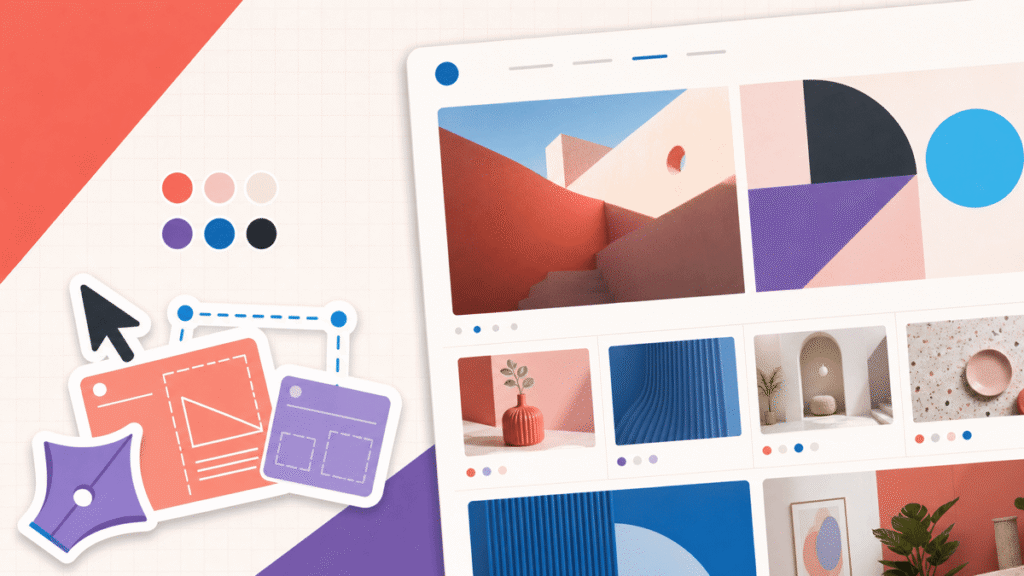
Most bad website design is not ugly. It is confusing. The page may use good colors, sharp images, and a modern template, but the visitor still cannot tell what matters or where to go.
That is the standard I use for every design decision: reduce the amount of work the visitor has to do. Make the message clear, make the next step obvious, and keep the visual system consistent enough that nothing important gets lost.
If you want to see the full design process on screen, Dale’s current premium website design walkthrough covers hierarchy, spacing, color, depth, motion, and responsive editing in Elementor.
Quick answer: fix clarity before decoration
My recommendation: fix the homepage hero, navigation, primary button, body text, and mobile layout before you change the theme or add effects. Those five areas control whether someone understands and can use the site. Decorative polish comes after the path works.
| Fix first | What to look for | A practical test |
|---|---|---|
| Purpose | A specific headline and useful supporting sentence | Can a new visitor explain the page in five seconds? |
| Action | One primary button with a clear label | Is the next click obvious without reading everything? |
| Readability | Legible type, contrast, line length, and spacing | Can you read it comfortably on a phone? |
| Navigation | Familiar labels and a short path to key pages | Can someone reach the offer and contact page quickly? |
| Mobile | Intentional stacking, cropping, and touch controls | Does it work on a real device, not only the editor? |
Start at the top of this list. A clearer purpose and action will improve the experience before a new font, animation, or background has a chance to matter.
The five-second test: show the homepage to someone who has never seen it, then hide the screen. Ask what the site offers, who it is for, and what they would click next. Their answers will tell you more than another hour of changing colors.
The difference is the amount of interpretation you leave to the visitor. Clear design makes those decisions before the screen loads.
| The goal Clear design | High-friction design | |
|---|---|---|
| First impression | I know what this is and who it is for | What is this page trying to say? |
| Primary action | One action clearly leads | Several buttons compete |
| Visual system | Type, color, spacing, and buttons repeat | Styles change section by section |
| Mobile experience | Content is reordered and tested for touch | Desktop squeezed onto a phone |
| Visitor effort | Low | High |
Swipe to compare more options. Clear design stays pinned.
You do not need to impress a visitor with every section. You need to make the right message and next step easy to find.
1. The page does not explain itself
A vague hero forces the visitor to assemble the meaning from a slogan, a stock photo, a menu, and three buttons. “Welcome to our website” says nothing. “We create memorable experiences” could describe a restaurant, event company, travel agency, or magician.
Write the first screen around three answers: what you provide, who it helps, and what the visitor should do next. A local designer might use “Brand and web design for Austin restaurants” with a “View Our Work” button. The right person understands the offer before they scroll.
- Headline: name the offer, result, audience, or problem in plain language.
- Supporting copy: add the detail that makes the promise believable and specific.
- Primary action: label the button with what happens next.
- Visual: show the work, product, person, result, or service in context.
The exact hero changes by project. Use the dedicated plan for a business website, portfolio, blog, or online store. Each guide shows what that visitor needs to understand before acting.
2. Too many calls to action compete
A visitor should not have to choose between Shop, Subscribe, Book, Call, Download, Watch, Follow, and Learn More in the same section. When every action has the same color and weight, none of them leads.
Choose one primary action for the page. Supporting actions can still exist, but they should look secondary and appear where they make sense. A service page can lead with “Request a Quote” and offer “View Projects” as a quieter text link. A product page should lead toward the cart, not the newsletter.
The style change in the clip is small, but the effect is useful: the action looks interactive and belongs to the rest of the design.
Use button labels that finish the sentence “I want to…” View the portfolio, compare plans, book a call, start the tutorial, or add the product to the cart. “Submit” and “Learn More” make the visitor guess.
3. Everything has the same visual weight
Visual hierarchy is the order in which the eye notices things. Size, contrast, position, spacing, and repetition create that order. If the logo, headline, image, paragraph, menu, badge, and buttons all shout at once, the visitor has to design the page in their own head.
Make the page scannable without removing the substance. Use one H1, clear H2 sections, short paragraphs, descriptive link text, and visual emphasis on the few details that change a decision. A bold sentence is useful. Six bold sentences in a row are wallpaper.
4. Spacing feels random
Bad spacing is easy to feel and hard to name. A heading floats halfway between two sections. A button touches the paragraph above it. One card has twice the padding of the next. The page feels slightly crooked even when every element is technically aligned.
Use a small spacing scale and repeat it. Related items should sit closer together; separate ideas need more room. Set the section padding, content gap, paragraph spacing, and card padding once, then reuse those values instead of dragging every block until it looks close.
If the whole process still feels abstract, the complete website design guide turns hierarchy, templates, spacing, typography, color, imagery, and polish into one workflow.
5. Colors, type, and buttons change from section to section
Consistency lowers the learning curve. When every primary button looks the same, visitors learn what it means. When headings use a predictable scale, they can scan the page. When the accent color always marks an action, it stops being decoration and becomes a signal.
Create a tiny design system before building more pages: one heading font, one body font, a type scale, one primary button, one secondary button, a small color palette, standard corner radiuses, and a spacing scale. Save those as global styles in the builder whenever possible.
Our website color scheme guide shows how to assign clear roles to the palette instead of collecting attractive swatches with no job.
Design approach
Starting from a professional template
Why it helps
- The hierarchy has a head start A good template already establishes a grid, section rhythm, heading scale, and primary action.
- Responsive behavior is included Columns, navigation, images, and buttons begin with sensible rules for smaller screens.
- You can focus on the message The time you save on basic structure can go into specific copy, useful proof, and better images.
What can still go wrong
- Demo content can survive the launch Placeholder copy, stock photos, fake reviews, empty pages, and dead buttons make the site feel unfinished.
- The result can feel generic If you keep every section and only swap the logo, the template still owns the personality.
- Extra features add clutter Delete sections and effects that do not help the visitor understand, trust, or act.
6. The text is hard to read
Tiny gray type may look elegant on a large monitor. On a phone in daylight, it disappears. Long centered paragraphs are tiring. Wide lines force the eye to travel across the entire screen and find the beginning again.
Use a comfortable body size, a readable line height, short paragraphs, and strong contrast between text and its background. As a practical accessibility baseline, WCAG 2.2 calls for at least a 4.5:1 contrast ratio for normal text and 3:1 for large text. Check the actual color pair with a contrast tool instead of judging it by eye.
- Body copy: keep it large enough to read without zooming.
- Line length: constrain wide text columns so the eye can track each line.
- Alignment: use left alignment for paragraphs in left-to-right languages.
- Contrast: test text, button labels, form borders, and focus indicators.
- Hierarchy: make headings clearly different from body copy without using five font families.
Color cannot carry meaning by itself. Pair errors, success states, charts, and selected controls with text, icons, patterns, or another visible cue. “The red fields are required” does not help everyone.
7. The imagery is generic, stretched, or badly cropped
A good image proves something the copy cannot. It shows the product, the work, the person, the place, or the result. A random handshake photo beside a paragraph about trust adds no evidence. It only takes up space.
Use real project photos, product shots, screenshots, team images, diagrams, or carefully chosen stock media that fits the page. Crop repeated image groups to consistent ratios. Compress large files before upload, and write alternative text when the image communicates useful information.
If you need supporting visuals, our royalty-free image website guide compares the strongest places to find them. The goal is still relevance. A free image is not useful because it is free.
8. Navigation makes visitors decode the site
Navigation should feel familiar. A five-page site does not need three dropdown levels, and a clever label is not better than a clear one. Visitors already know what About, Services, Work, Shop, Blog, and Contact mean.
Keep the main menu short, put the most important destinations where people expect them, and make the logo return to the homepage. Use the footer for legal pages, secondary resources, and contact details that do not belong in the primary path.
- Every menu label describes the page behind it.
- The active page is visually identifiable.
- Keyboard focus is visible on links, buttons, and form controls.
- Dropdowns work with a keyboard and do not disappear before a selection.
- The mobile menu opens, closes, scrolls, and reaches every important page.
9. Motion and effects compete with the content
Animation is not automatically bad. A small hover state confirms that a button is interactive. A gentle transition can show that a panel opened. Motion becomes a design mistake when it delays the message, moves several objects at once, or makes a visitor chase the interface.
Use motion to explain a change or guide attention. Remove it when the page works better without it. Avoid autoplay audio, give visitors control over video, respect reduced-motion preferences, and do not hide essential content behind an animation that must finish first.
Extra media also adds weight. Compress images and video, lazy-load supporting assets appropriately, and use the WordPress speed optimization guide if a visually rich page has become slow.
10. Mobile is treated like a smaller desktop
Responsive design is not shrinking the desktop page until it fits. A three-column section becomes a long stack. A wide hero image crops around a different focal point. Side-by-side buttons may need to become full-width. The phone version needs its own pass.
Check the order of every section, then read the page from top to bottom on a real phone. Fix headings that wrap awkwardly, images that crop out the subject, buttons that sit too close together, forms that run off the screen, sticky elements that cover content, and decorative pieces that create a mile of scrolling.
Google uses the mobile version of a page for indexing and recommends responsive design because it is the easiest pattern to implement and maintain. Keep the important content, headings, metadata, and image descriptions equivalent across desktop and mobile. Change the presentation when the smaller screen needs it.
Test with your thumbs. Hold the phone naturally. Can you open the menu, tap the main button, move through a form, dismiss a popup, and reach the footer without precision tapping?
A simple website design audit
Do not redesign the entire site because one page feels off. Start with the highest-value path: homepage to offer, offer to proof, proof to contact or checkout. Audit that path in this order:
- Message: can the right visitor identify the offer and audience quickly?
- Path: does one primary action lead to the next useful page or step?
- Content: are the copy, proof, images, prices, contact details, and forms current?
- Readability: can someone scan the page and read it comfortably?
- Consistency: do colors, type, spacing, buttons, cards, and images follow a system?
- Accessibility: are contrast, labels, focus, keyboard use, and error states understandable?
- Mobile: does the full path work on a real phone?
- Performance: do the important pages load without oversized or unnecessary media?
If the foundation itself is wrong, use the step-by-step website guide to rebuild the plan before rebuilding every page. If the tool is the limitation, compare the current options in our best website builders guide.
Website design mistakes FAQs
Frequently Asked Questions
What is the biggest website design mistake?
The biggest mistake is making the visitor figure out what the page is about and what to do next. Start with a specific headline, one supporting sentence, and one primary action. Everything else on the page should support that path.
How can I tell if my website design is bad?
Give someone the homepage for five seconds, then hide it. Ask what the site offers, who it is for, and what they would click next. Confused answers usually point to a hierarchy or messaging problem. Also test the site on a real phone, use the keyboard to move through interactive elements, and submit every form.
How many colors should a website use?
Most sites can begin with one primary brand color, one supporting color, and one accent, plus light and dark neutrals. Give each color a job and repeat it. Our website color scheme guide shows how to build the full system.
How many fonts should a website use?
One body font and one heading font are enough for most websites. A single font family with several well-chosen weights can work even better. The important part is a consistent scale for headings, body copy, labels, and captions.
Should a website logo be centered or left aligned?
Either can work. A left-aligned logo is familiar and leaves room for navigation, while a centered logo can suit a simple or editorial layout. The real test is whether visitors can recognize the brand, reach the homepage, and find the menu without hunting.
Is animation bad for website design?
No. Animation is useful when it explains a change, provides feedback, or guides attention. It becomes a problem when several elements move at once, important content waits for an effect, or the motion makes reading and navigation harder.
How do I improve a website without redesigning everything?
Fix the highest-friction path first. Clarify the headline, choose one primary button, simplify the navigation, increase text contrast, standardize spacing, compress oversized images, and correct the phone layout. Those changes usually matter more than a new theme.
Should I design my website from scratch?
Usually not. A professional template gives you a working structure and responsive baseline. Customize it until the copy, images, colors, proof, and page order fit the real project. The complete website design guide shows the process.
Make the next step obvious
A strong website does not ask the visitor to admire every decision. It helps them understand, trust, and act. Fix the message, hierarchy, readability, navigation, and mobile path first. Then add the polish that supports those jobs.
You do not need a perfect redesign to make meaningful progress. Choose the most important page, run the audit above, and remove one piece of friction at a time. The site will feel better because it works better.