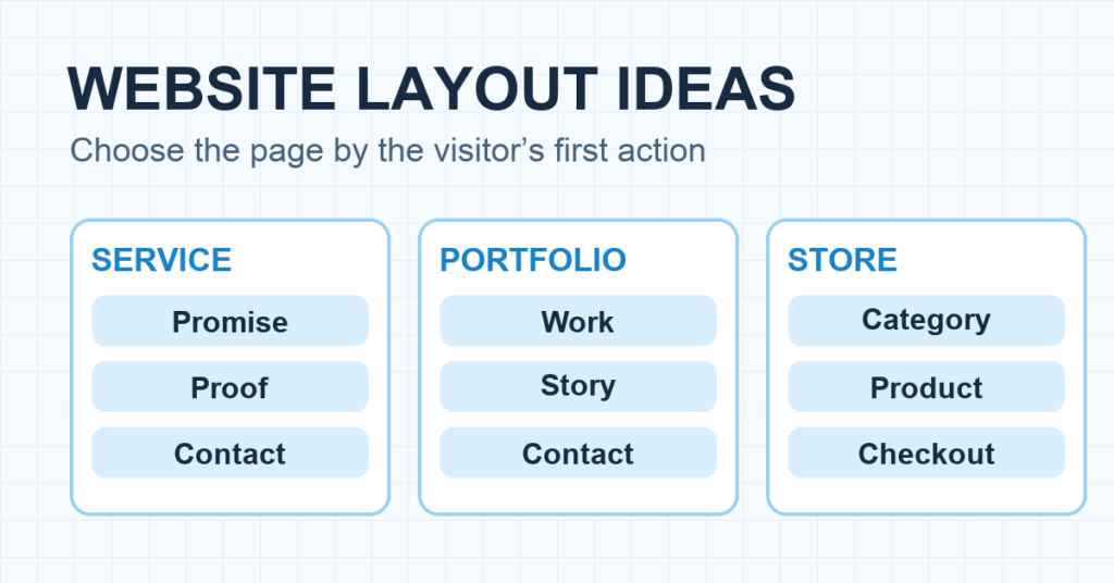
If you know what your website needs to say but can’t decide where anything goes, start with the visitor’s first job. A service buyer needs proof and a way to contact you. A shopper needs products and a path to checkout. A reader needs to understand what the site covers and find the next article. Those jobs call for different page layouts.
Below are six website layout ideas you can use as starting points. Each one shows the order of the main sections, where the primary action belongs, and what changes on a phone. Pick one pattern before you start moving blocks around in WordPress.
Quick answer: For most first business sites, use a simple stacked layout: clear promise, one primary button, proof, offer details, and a final contact path. Use a gallery-led layout when the work itself sells you. Use a product grid when people need to compare items. Then test the page at phone width before you publish.
1. The service layout: promise, proof, then contact
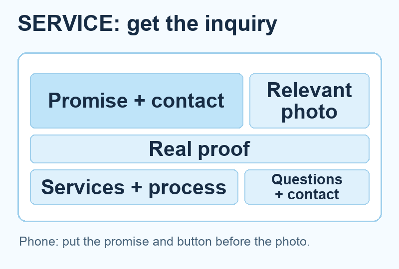
A service homepage should answer three questions almost immediately: What do you do? Is it for me? What happens if I click? Put that information in the first screen. A short headline, one sentence of context, and one button usually beat a rotating hero full of slogans.
Below that, show a specific result or piece of work. Then explain the service in plain terms and answer the question that stops someone from contacting you. For a local web designer, that might be what a project includes. For a home service, it might be the area served and how estimates work.
Section order: promise and action → proof → services → process → questions → contact. The process matters because a visitor may like the work and still have no idea what happens after they ask for a quote.
On mobile, keep the headline and primary button together. If your desktop hero has the text on the left and a photo on the right, stack the text first. A photo that pushes the button below a full-screen scroll has taken over the page.
The contact path can be short because the proof did its job first. A portfolio needs a different order: the work itself has to carry the first impression.
2. The portfolio layout: show the work before the biography
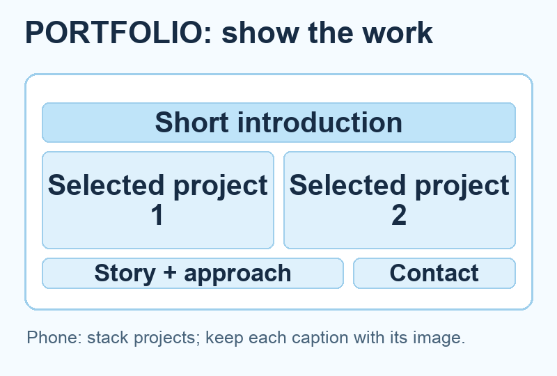
A portfolio earns attention through examples. Lead with a short introduction and a small selection of your best work. Give each project enough context to mean something: the problem, your role, what you made, and the result if you can substantiate it. A wall of thumbnails makes the visitor do all the interpretation.
Section order: short introduction → selected projects → one project story → about and approach → contact. You can put a clear contact button in the header, but don’t make the visitor read your entire career history before seeing the work.
Use a grid on a wide screen and one column on a phone. Keep the project title and description attached to its image in both layouts. Test with your weakest or longest project title, not just the neat two-word example in the template demo.
If you have only one strong project, give it a full case-study section. One explained piece of work is better than six empty cards. For the site-building steps, our portfolio website guide covers the wider setup; this page is about the layout decision.
A portfolio can leave location in the background. A local business cannot: the visitor needs to know whether the place is nearby and open before deciding to call.
3. The local layout: make the next visit or call easy
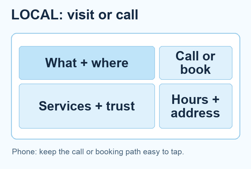
A restaurant, clinic, shop, or studio needs practical information in easy reach: location, hours, service area, booking or phone number, and the thing people came to see. Don’t bury these in a tiny footer while the homepage spends three screens on atmosphere.
Section order: what and where → primary action → current offer or services → trust details → location and hours → frequently asked questions. For a restaurant, the primary action might be “View menu” or “Book a table.” For a repair shop, it might be “Call for an estimate.” Choose the one action that fits the real operation.
A map is useful once the address and context are clear. Put the address in text too, so it can be copied and understood if the map fails to load. On mobile, make the call or booking button easy to tap and keep the hours readable without pinching.
This isn’t a claim that one button placement guarantees more calls. It is a way to remove avoidable friction for someone already trying to reach you.
A clear phone number can finish a local visitor’s job. A store visitor still has to choose what to buy, so the product choices must carry more of the page.
4. The store layout: a small path from category to product
A store homepage shouldn’t attempt to display the whole catalog. It should orient a shopper: what kind of products are here, where should I start, and how can I compare the options? Lead with a clear category or featured collection, then show a short product selection with useful names and prices.
Section order: store promise → categories → selected products → buying reassurance → shipping or returns information → deeper catalog. A narrow store might start with its hero product instead of categories. The layout should reflect how the customer chooses, not how many widgets the theme offers.
On desktop, a product grid can carry three or four cards per row if the images and labels stay legible. On a phone, use one or two. Check the longest product name, sale price, and button state. If the button says “Choose options,” the shopper should know what those options are before checkout.
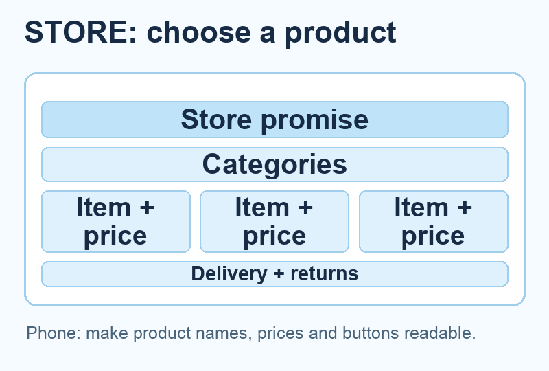
Before you share a store, complete a real test order and verify its confirmation and delivery path. Our online store guide goes through the build. The layout gets the buyer to a product; the transaction test proves the site can finish the job.
A product grid helps shoppers compare. A publication needs a navigation path because readers arrive with different questions.
5. The editorial layout: give readers a route, not a wall of posts
A blog or publication needs a clear topic promise and a way to navigate its archive. Lead with the topic or a carefully chosen starting article. Then group the next articles by reader need. “Start here,” “How to,” and “Reviews” are more useful than a single reverse-chronological feed when a new visitor has a specific problem.
Section order: topic promise → start-here path → featured article → topic groups → latest posts → subscription or return path. The latest-post feed still matters; it just should not do all the work.
On a phone, category navigation often becomes cramped. Use a short visible list or simple links instead of making every category a tiny pill. If the first article card takes a whole screen before its title appears, adjust the image crop or card spacing.
A newsletter invitation belongs after the reader has seen what they’ll get. If the site is new and the archive is thin, show the three strongest articles rather than pretending you have a sprawling publication.
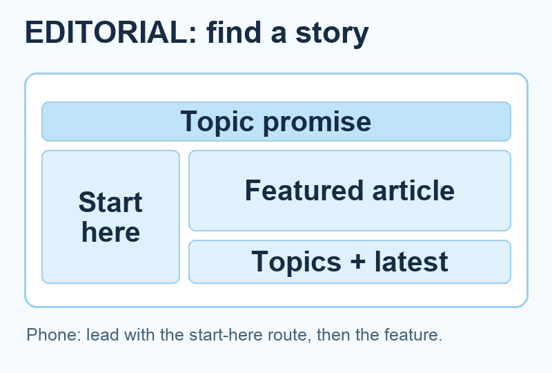
The topic groups give a reader several useful routes. A landing page can be narrower because one offer asks for one decision.
6. The landing page layout: one offer, one decision
A landing page should make the decision obvious. Say what the offer does, who it is for, what the visitor gets, and what happens after the button. Then provide the proof and objections needed for that choice. A busy site-wide menu can pull people away before they’ve understood the offer.
Section order: offer and action → explanation → proof → what is included → objections → final action. The first and last buttons should lead to the same destination. For a real split-screen example, Figma points to Dropbox’s trial page: the form and plan context sit together so a visitor can decide without hunting for the terms. Our diagram uses a simpler stacked version for a single offer. The proof should be real: a working example, an attributed testimonial, a current product screenshot, or a clear demonstration. Don’t invent a happy customer because the template has a quote box.
On mobile, inspect the actual form or checkout path. A button that fits beautifully on a desktop mockup can sit under a sticky bar on a phone. Our WordPress landing-page tutorial covers the build; use this pattern to decide the section order before opening the editor.
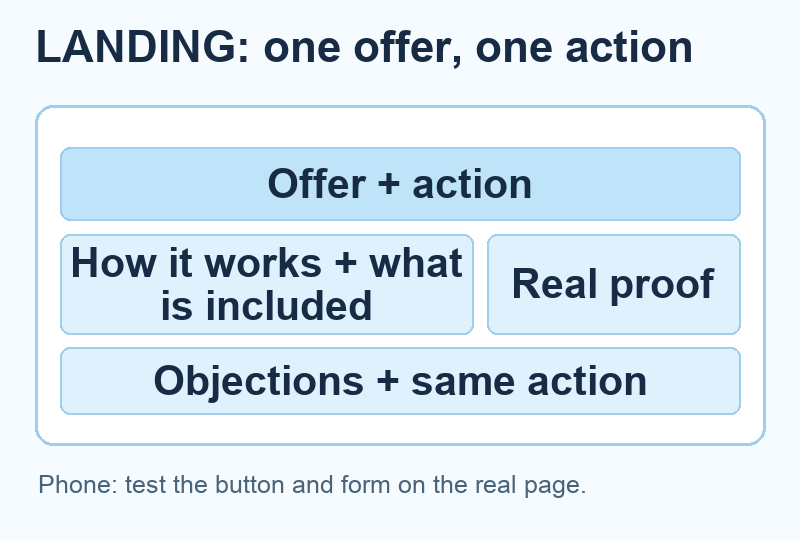
A landing page is easiest to judge because it has one job. Use the same discipline to choose between all six patterns.
Which layout should you use?
Write the visitor’s first action in one sentence. “See my work and ask about a project” points to the portfolio pattern. “Find a product and buy it” points to the store pattern. “Learn this topic and choose a next article” points to the editorial pattern. If you cannot finish that sentence, the page layout is not the first decision to make.
| Visitor’s first job | Start with | Keep visible near the top |
|---|---|---|
| Ask about a service | Service | Promise, proof, contact action |
| Judge creative work | Portfolio | Selected work and project context |
| Visit or call nearby | Local | Location, hours, call or booking path |
| Choose an item | Store | Categories, products, prices |
| Find useful information | Editorial | Topic promise and start-here route |
| Decide on one offer | Landing page | Offer, outcome, next step |
My recommendation for a first site: start with the service pattern unless the work itself is the product. It gives visitors a clear answer, a reason to trust you, and a next step without making you fill a giant template. Once you pick a pattern, start with a template that already has roughly the right structure. Replace its sample content with your real offer, projects, products, or articles. Remove sections that don’t help the visitor’s job. You can polish the colors later.
Then open the real page on a phone and try the primary action yourself. Our website launch checklist gives you the rest of the final checks. A layout is finished when a visitor can understand the page and complete its next step, not when the editor canvas looks full.
Frequently Asked Questions
What is the easiest website layout for a beginner?
A simple stacked layout is easiest to build and test: headline, short explanation, primary action, proof, details, and final action. Start from a template and remove what you cannot support with real content.
Should the mobile layout match the desktop layout?
It should preserve the same information and action, but it may need a different order. Two-column desktop sections usually stack on a phone. Put the message and button before a large decorative image when that better serves the visitor.
How many sections should a homepage have?
Enough to answer the visitor’s decision and no more. A narrow service site might need five or six useful sections. A store or publication may need more navigation. Test whether each section helps someone understand, trust, choose, or act.