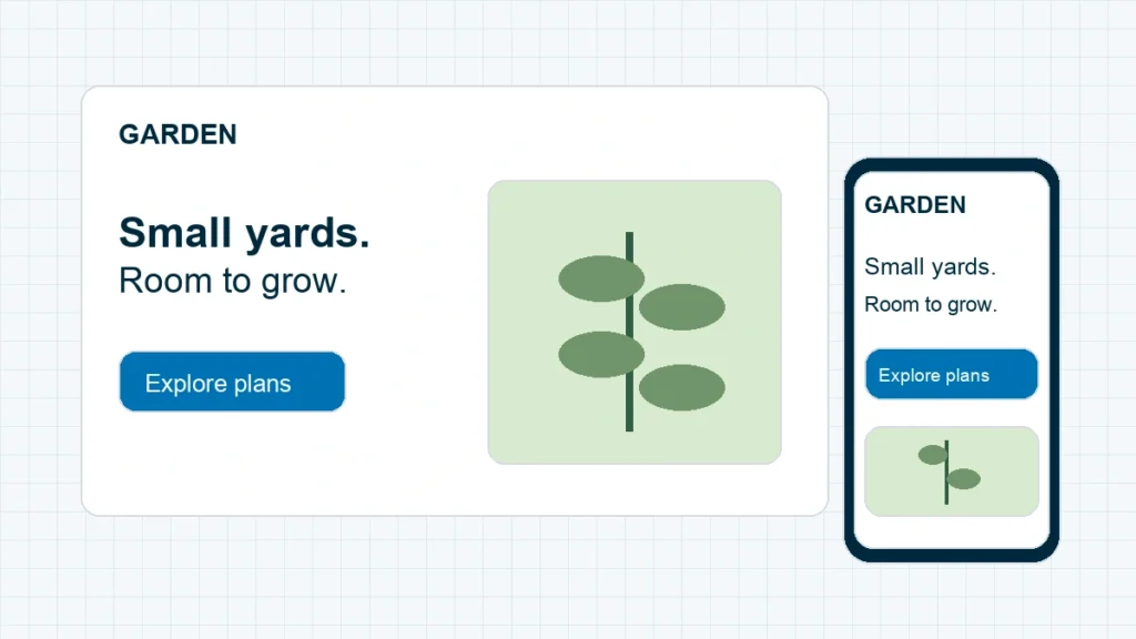
To make a website mobile friendly, use a layout that adapts to the screen, keep text readable, give buttons room, and test the whole visitor journey on a phone. Start with the page people actually use. A homepage can look beautiful while its menu hides the contact link or its form disappears behind the keyboard.
We’re going to work through those problems in an order that makes sense: fit the page, make it usable, then check that the important action works. You can follow this with WordPress or another website builder. The setting names change; the checks don’t.
Quick answer: fix page-wide sideways scrolling first. Then check reading order, navigation, images and forms. Finish on a real phone, including the confirmation screen or message. A desktop preview alone cannot prove the job is done.
1. Find the first thing that breaks on a phone
Open your most important page on your phone and try the action you want a visitor to take. For a service business, that might mean opening the menu, choosing a service and requesting a quote. For a blog, it might mean reading an article and signing up for the newsletter.
Write down the exact page address and the first failure. “Mobile looks bad” is hard to fix. “The Send button is outside the screen on the contact page” gives you somewhere to start.
| What you see | Check this first |
|---|---|
| The entire page slides sideways | A fixed-width container, image or embed |
| The page fits, but words are tiny | Text sizing and the page’s viewport setting |
| The menu opens over the page and won’t close | The menu’s close control and overlay |
| The form looks fine until you type | Keyboard space, field layout and sticky elements |
That first symptom keeps you from changing five unrelated settings at once. Take a screenshot before editing so you can compare the result with what was actually broken.
On a computer, Chrome’s DevTools → Toggle device toolbar lets you inspect the page at different widths. Choose Responsive and enter a narrow width, then drag wider slowly. Chrome describes this as an approximation, so use it to find problems quickly and keep your phone for the final check.
Before changing a theme or shared layout, make a WordPress backup you can restore. Use staging when available. A repair to the header can affect every page, even if you started on just one.
2. Fix the page width before shrinking the text
A wide container can push perfectly good content off the screen. Making the font smaller won’t fix that container; it just leaves visitors with smaller text and the same underlying problem.
In your builder’s mobile preview, select the section that extends beyond the edge. Check for a fixed width, a minimum width, large side padding or a negative margin. Change one setting, preview the result and check desktop again before continuing.
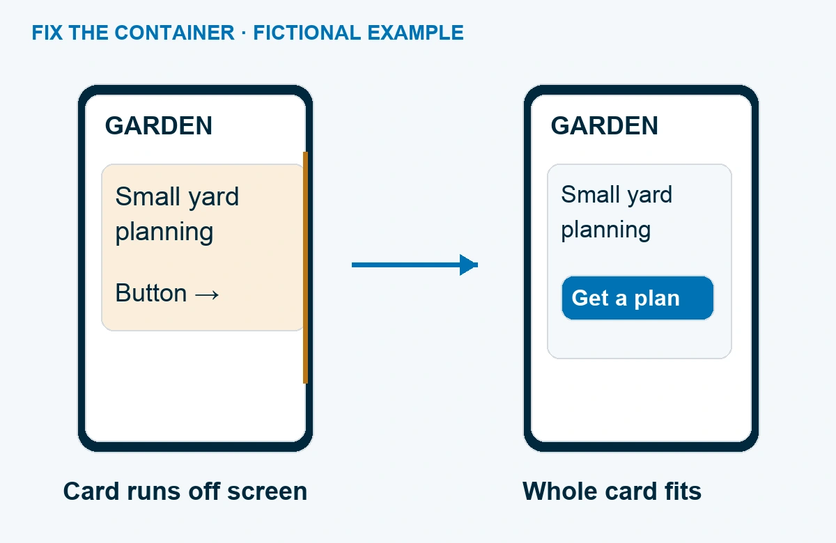
For example, suppose the offending card has a 600-pixel fixed width on a 390-pixel screen. If your builder offers a mobile width override, change that card to 100% of its parent, then check for any minimum-width setting that still forces it wider. Leave the desktop value alone. Reload the public page and confirm the full card fits; if it still sticks out, inspect the parent container next.
If everything looks like a tiny desktop page, ask your developer to check the viewport tag. Google’s responsive design guide explains why the page needs to match the device width. Modern themes usually handle this; pasting another tag into your article body isn’t the solution.
Images and embedded content also need to fit their containers. For a custom-coded site, a developer can use flexible sizing and inspect the element creating the overflow. Avoid applying a site-wide “hide overflow” rule as the first repair. You want the missing content back inside the page, not cut off out of sight.
Checkpoint: you can read the main content and reach every button without dragging the whole page sideways. A deliberately scrollable data table is a separate case: keep its scrolling inside a clearly bounded area.
3. Stack the content in the order a visitor needs it
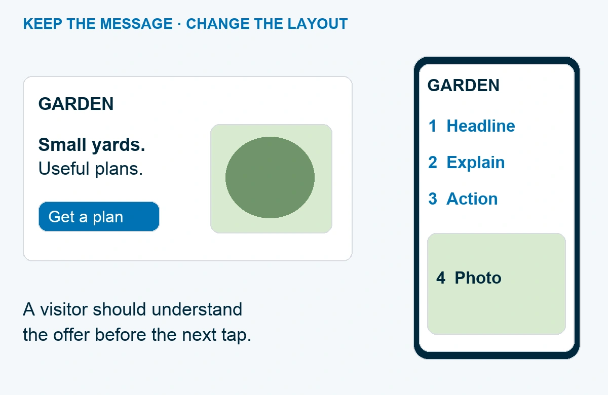
A desktop hero might put the headline on the left and a large photo on the right. On a phone, those pieces usually need to stack. The useful question is what comes first when they do.
For a fictional garden-design business, “Garden plans for small city yards” tells the visitor more than a full screen of leaves. Put the promise and its supporting explanation where people can find them, then use the photo to show the work. The button should stay close to the explanation of what happens when someone taps it.
Don’t remove the useful details just to make the mobile page shorter. Google uses the mobile version of a site’s content for indexing. Its guidance recommends keeping primary content equivalent across mobile and desktop; you can present that content differently.
In Elementor, look for the device control beside a supported setting. Its responsive editing documentation explains device-specific changes; the controls vary by editor version. Check whether you’re changing a mobile override or a shared value before saving. Our Elementor tutorial covers the broader page-building workflow.
Use the same check for headings. If a headline breaks into six short lines, try a smaller mobile heading size and sensible side padding before shortening the message. Read it at normal zoom. If you have to squint, the repair went too far.
4. Give the menu and buttons enough room to work
A mobile menu has to open, reveal useful destinations and close again. Test all three. A menu that covers the page but leaves its close button under a sticky banner is a dead end, even if every menu link is technically present.
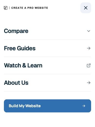
Use labels a new visitor can understand. “Services” and “Contact” are easier to interpret than two clever words that only make sense after someone knows your business. If your menu has several nested levels, check each level on the phone rather than assuming the desktop hover behavior carries over.
For buttons, make the clickable area generous and leave space between neighboring controls. A roughly 44-by-44 CSS-pixel target is a practical starting point for important buttons. That’s a design recommendation, not a claim that every link must meet that size: WCAG 2.2’s minimum target-size criterion uses 24 by 24 CSS pixels with stated exceptions.
Try the close button on a popup, too. Then scroll to the bottom of the page. Sticky navigation, cookie notices and floating contact buttons can overlap one another there. Keep the action people need visible without covering the content they came to read.
5. Make images useful at phone size
An image can fit inside the screen and still fail its job. A wide screenshot with tiny labels becomes unreadable when squeezed down. A background photo can crop out the product you’re trying to sell. Check the actual result rather than the upload dimensions alone.
Choose the repair that matches the image:
| Image problem | Useful repair |
|---|---|
| The subject gets cut off | Adjust the crop or focal point for the narrow layout |
| Text inside the image becomes tiny | Use a closer detail or put the information in real page text |
| A large photo delays the page | Resize and compress the source; check the result for visible damage |
After replacing an image, reload the public page on your phone. Watch what happens while it appears. If the button jumps away just as you’re about to tap it, ask your builder or developer to reserve the image’s space before loading.
Keep the layout repair separate from a full performance project. If the page now fits but still loads slowly, our WordPress performance guide takes you through that next layer. Don’t install several optimization plugins at once and hope one solves it; you’ll make the cause harder to identify.
6. Test the form with the keyboard open
A form is only useful if a visitor can finish it. Open every required field on your phone and enter a clearly labeled test inquiry. Notice whether the keyboard hides the next field, whether the page still scrolls and whether any sticky element covers the submit button.
Keep visible field labels. A placeholder can disappear as soon as someone starts typing, leaving them unsure what the field was asking for. Use the appropriate email or telephone input where your form builder supports it, and remove questions you don’t need for that first conversation.
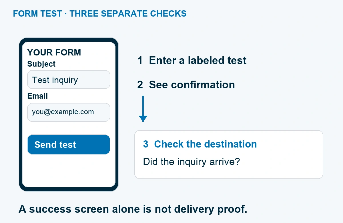
Send one test through your own form and verify the destination inbox or system. Use a test mode or staging environment for payment flows; an ordinary form test should not create an unintended paid order. If you need help with the form itself, use our WordPress contact form guide.
Also submit with a required field empty. The error should explain what needs fixing and remain visible on the phone. A visitor shouldn’t have to guess why nothing happened.
7. Recheck the public page and keep a small test record
Save your changes, open the public page in a fresh browser session and repeat the original task. Check the narrow layout, a wider phone layout and desktop. Rotate your phone once, then try zooming text. You shouldn’t need to disable zoom to keep a design together.
If the editor looks correct but the public page still shows the old layout, check the site’s cache process. Clear only the relevant cache using the site’s normal controls, reload and compare again. If the repair introduces a new problem, undo that change or restore the saved version before trying another approach.
Keep a short record with the page address, device/browser, date, problem and result. “Contact page: menu opens, form submits, test inquiry received” is useful. “Mobile done” doesn’t tell you what to repeat after the next redesign.
Google retired its Mobile-Friendly Test and Mobile Usability report in December 2023. You don’t need to chase a replacement badge to finish this task. Use browser tools to investigate, a real phone to test the journey and your receiving system to confirm the outcome.
For the rest of a launch, follow our website launch checklist. For this repair, stop when the visitor can complete the page’s main job comfortably on a phone and your changes still work on desktop. That’s a result you can check again next time.
Frequently Asked Questions
Is a responsive website automatically mobile friendly?
Responsive design adapts the layout to screen size. You still need to check readability, navigation, loading and forms. A responsive page with an unusable menu needs more work.
Do I need a plugin to make WordPress mobile friendly?
Start with your theme and builder’s existing responsive settings. A plugin is not a substitute for fixing an oversized container or broken menu. Identify the specific missing function before adding another dependency.
Can I make my website mobile friendly without code?
Many layout repairs are possible in your builder: column order, spacing, text size and supported mobile settings. A custom widget, theme bug or broken third-party embed may need developer help. Give the developer the page address, screenshot and repeatable symptom.
Why does my page look different in the editor and on my phone?
The preview width, saved changes, cache and public theme styles can differ. Save first, check the public URL in a fresh session and compare at the same width. Keep the actual phone check even after the editor looks right.
Should I hide content to make the mobile page shorter?
Keep the primary information visitors need. Change the layout, reduce unnecessary decoration or use an accessible accordion where appropriate. Don’t remove the answer, product details or contact path just to reduce scrolling.