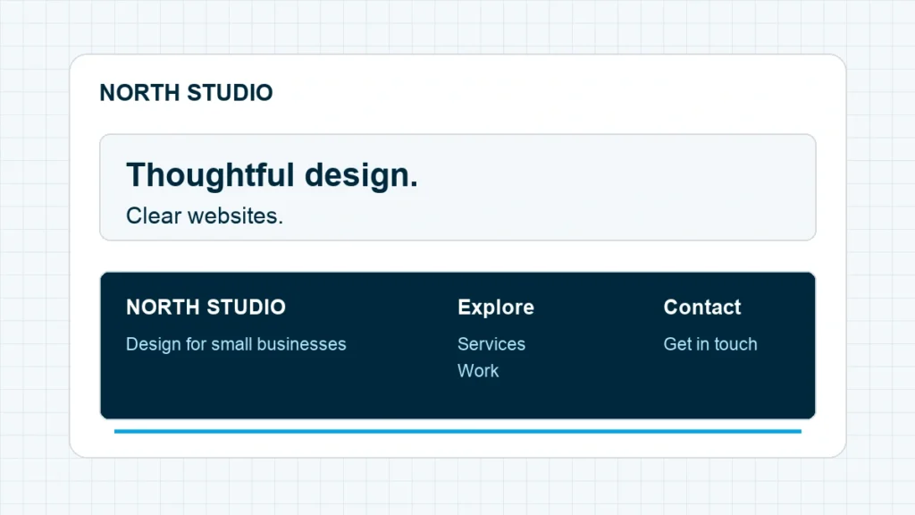
A website footer is the section at the bottom of a page that helps visitors find contact details, useful links, and information about the site. A good footer gives someone who has finished scrolling a clear way forward. It shouldn’t become a storage box for every page you couldn’t fit in the menu.
For a first business website, I’d start with a short description, a few useful destinations, a contact route, and links to the policies that apply to the business. Add more only when you can name the visitor’s reason for needing it. Below, we’ll turn that starting point into three practical footer designs and a checklist you can test on your own site.
Start with the unfinished visitor task. Someone at the bottom of your page may need to contact you, check delivery information, or find another guide. Make those routes obvious before adding decorative badges or more links.
Give the footer a different job from the header
Your header helps a visitor start. Your footer helps them continue, recover, or check a detail. Some destinations belong in both places, but you don’t need to repeat every menu item in the same order.
Imagine someone reading a designer’s service page. They’ve seen the work, read the process, and reached the bottom. A contact link is useful there. So is an About link if they still want to know who they’ll work with. A list of every blog tag probably doesn’t help them decide.
Nielsen Norman Group’s footer research describes how people use footers to find expected information and take another route when the main navigation hasn’t resolved their task. That gives us a better design question than “How many columns should this have?” Ask what someone might still be looking for.
The footer also needs to make sense when a visitor arrives on an individual article or product page. They may never have seen your homepage. Keep the business identity clear enough that the bottom of the page doesn’t feel like a collection of anonymous links.
Choose what belongs in your website footer
Begin with content you actually maintain. A visible phone number that nobody answers creates a different problem from a missing number. An empty social profile doesn’t become useful because a template includes its icon.
Use this table as a selection guide. These are design choices, not a universal list of legal requirements; your business’s actual obligations determine which policy and disclosure pages you need.
| Footer element | Include it when | Keep it useful |
|---|---|---|
| Business name and short description | Visitors need a reminder of who the site serves | Use one clear sentence, not the homepage introduction again |
| Contact or booking link | Contact is a meaningful next step | Name the destination accurately: Contact, Book, or Request a quote |
| Address, service area, or hours | People need to visit, call, or check coverage | Keep the details current and readable as text |
| Important navigation | Visitors need a second route through the site | Group a short selection under plain labels |
| Help, delivery, or returns | Customers need purchase support | Link to the actual information, not a generic empty FAQ |
| Privacy, terms, and disclosures | Those pages apply to your operation | Link to current pages written for the real business |
| Newsletter signup | You have a clear ongoing promise and a working signup path | Explain what arrives and test delivery |
| Social profiles | The profile is active and helps the visitor | Use recognizable labels and working destinations |
A copyright line can identify the site owner without becoming the whole footer. Check that the business name is right, especially if you’ve imported a template. Don’t leave someone else’s name or a placeholder year behind.
Contact information should be a route a person can use. If you link to a form, our WordPress contact form guide covers the setup. Test what happens after submission, too. A thank-you message on screen doesn’t prove that the inquiry reached the right inbox.
Start with one of these three footer layouts
The examples below are fictional designs, so you can adapt the structure without copying another business’s identity. Each one solves a different end-of-page task. Pick the closest fit, then remove anything you don’t have a reason to include.
A service business: help someone start a conversation
For a small design studio, use three groups: a short business introduction, a handful of site links, and a contact route. The footer might say what the studio does, link to Services, Work, and About, then offer “Discuss a project.” Put the relevant policy links beneath those groups.
Keep the contact action connected to a real page. If the destination is an inquiry form, “Discuss a project” is clearer than “Get started” when nothing explains what starting means. Don’t promise an instant quote if a person has to review the request first.
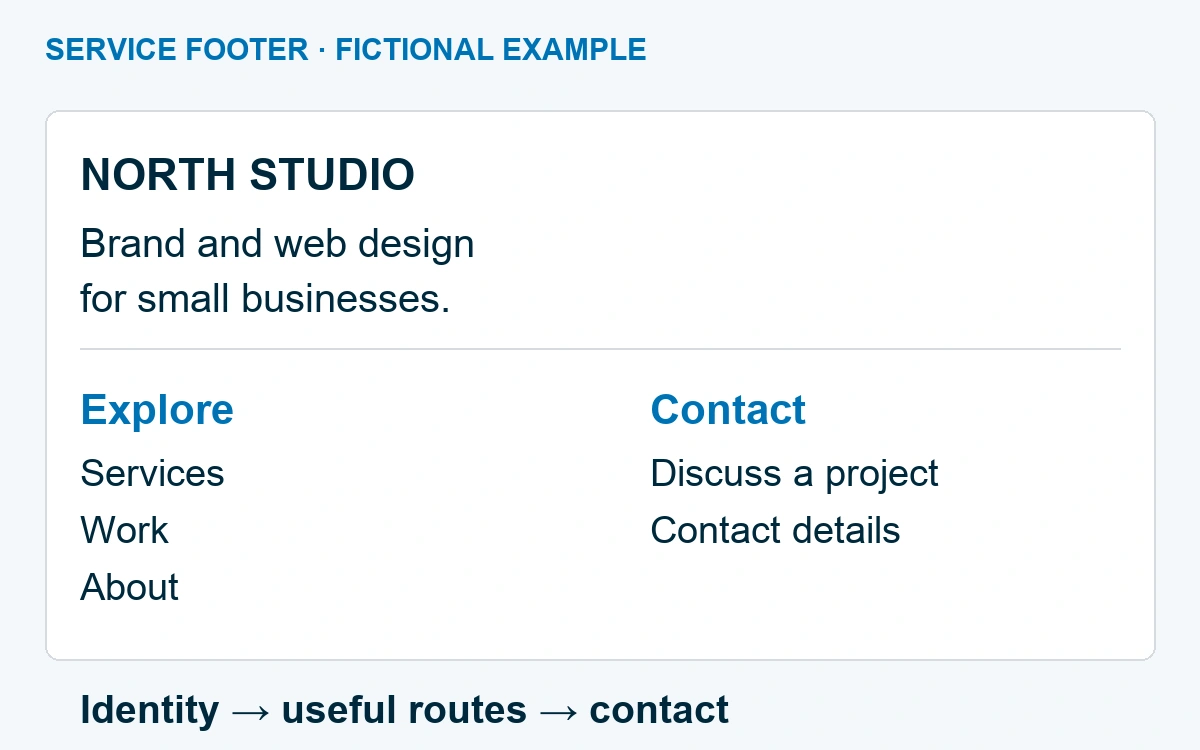
This layout works because the contact path doesn’t compete with a wall of options. If the rest of the page still needs arranging, our website layout guide shows how the service page can build toward that conversation.
A shop: answer the questions around the purchase
For a store, customer help deserves its own group. Delivery, returns, order support, and contact information are different from product categories. Putting them together under “Help” lets someone check the practical details without searching the catalog again.
Keep a small “Shop” group if category links help people browse. Avoid copying an entire product inventory into the footer. A category page can carry the changing products; the footer can keep pointing to that stable destination.
Any reassurance needs to match the actual operation. Don’t add a “Free returns” badge because the design looks unbalanced without it. Use the real policy, and make it easy to open before the visitor buys.
A blog or portfolio: help someone find the next useful piece
For a publication, a Start Here link or two or three clear topic routes may be more useful than another list of recent posts. For a portfolio, Work, About, and Contact may be enough. The footer doesn’t need to prove the size of your archive.
A newsletter invitation can fit when it explains the exchange: what subscribers receive and how often. “Join our newsletter” is a label. “One practical website lesson each Friday” is a promise, so use it only if that is the cadence you can maintain.
Choose one main action for the footer. If subscribing is the priority, don’t surround the form with three other large buttons. The supporting links can stay quieter without becoming tiny or unreadable.
Make the footer comfortable on a phone
Desktop columns often become a long stack on mobile. That is fine when the groups remain understandable. It becomes frustrating when headings detach from their links, text shrinks, or a signup field pushes off the screen.
Keep the order intentional. Put the business identity and most useful action where they can be found easily, then show the supporting groups. Short groups often work well fully expanded. If your theme collapses them, the controls need to work with touch and keyboard and clearly indicate whether each group is open.
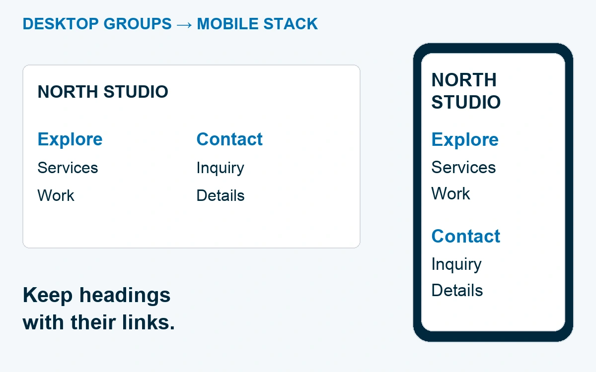
Use comfortable text sizes and space around links. W3C’s menu guidance emphasizes clear structure, keyboard operation, and usable click or tap targets. Small grey text may look subtle in the editor and disappear against the background on a real phone.
Try the footer with the longest real link label you plan to use. “International delivery information” exposes wrapping problems that “Help” won’t. Also check a long email address and any address or opening-hours text. Your neat demo content shouldn’t be the only thing the layout can handle.
Find the right place to edit it in WordPress
How you edit a WordPress footer depends on the theme and builder. First identify what controls the existing footer. A shared template part, a widget area, and a builder template are different editing paths.
In a block theme, start in Appearance → Editor → Patterns → All template parts, then select the footer used by your page. The exact labels can vary with the WordPress version and theme. WordPress’s Template Part documentation explains how to select an existing part and edit it. Changes affect the templates using that part, so review the save summary and check more than one page afterward.
With a classic theme, look at the theme’s documented footer controls, widget areas, and assigned menus. If a page builder owns the footer, use that builder’s template settings. Don’t paste a second footer into each page just because you can’t immediately find the shared one.
Before a shared edit, keep a recoverable copy of the current setup. Our WordPress backup guide explains why being able to restore matters as much as creating the backup. Then change the footer in its actual source and check a normal page, a blog post, and any store template that uses it.
A developer building the markup can use the appropriate footer and navigation elements so assistive technology can recognize those regions. W3C’s page-region guidance explains that structure. Visual placement at the bottom of the screen doesn’t provide those semantics by itself.
Remove the clutter that makes a footer harder to use
The easiest footer mistake is adding one harmless-looking item at a time until every link has the same importance. A social icon row, six badges, three subscription forms, and a complete sitemap can each have a purpose elsewhere. Together, they can bury the contact link someone came to find.
Group links by the reader’s task. “Explore” can hold a few content destinations. “Help” can hold purchase support. Give contact information its own clear place instead of mixing it between blog categories and legal pages.
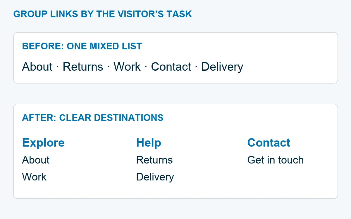
Remove links that point to empty pages, old campaigns, or inactive accounts. Check logos and badges against what you can substantiate. A footer is part of the website’s claims, even when the text is small.
Be careful with sticky elements. A sticky footer stays visible while people scroll; a normal page footer waits at the bottom. On a phone, a persistent bar can cover content or form controls. Only use one for a clear purpose, and check it alongside cookie notices or other overlays already on the site.
Test the last part of the page before you launch
Open the real page at phone and desktop widths. Start from the middle of an article or service page, scroll down, and try the task your footer is meant to finish. Can you find contact, support, or the next useful guide without reading every link?
Then use the keyboard. Tab through the footer, watch for a visible focus indicator, and open the important links. Check that the order is sensible and that any expandable group can be operated. These are practical checks, not a claim that the whole site has passed an accessibility audit.
Finally, test the destinations. Confirm that the contact route works, policy pages open, social links reach the right profiles, and the signup form behaves as promised. Use the website launch checklist for the rest of the site. The footer is finished when someone reaching the bottom can still complete a useful next step.
Frequently Asked Questions
What should a website footer include?
Start with the site’s identity, a clear contact route, a small set of useful navigation links, and applicable policy pages. Add hours, customer support, or a newsletter only when they serve the visitor and you can maintain them.
Should the footer match the main menu?
It can repeat important destinations, but it doesn’t need to duplicate the whole header. Include the routes people need after reading, plus practical information such as contact and support.
Does every page need the same footer?
Shared footers keep core information consistent. Some landing pages or special templates may use a simpler version. Check the real visitor task before removing navigation or adding a different footer.
How many links should a footer have?
There is no useful universal count. Keep the selection short enough to scan, group it clearly, and give each link a reason to be there. A small service site usually needs far fewer destinations than a large store.
Choose the footer pattern closest to your site and write its link groups in a plain document first. Once each destination has a job, building the layout gets much easier.